Papaverdriehoek

Read more about the site brief

Scale: Architecture and Urban scale

Team representative: Architects, Urbanist

Site family:

Location: Papaverdriehoek, Amsterdam

Population: Amsterdam: 835.000

Study area: 4,82 Ha

Project site: 0,15 Ha

Site provided by: City of Amsterdam

Actor(s) involved: City of Amsterdam

Owner(s) of the site: Mixed ownership

Prizes: 1st Prize €12,000, Runner-up €6,000, Special mentions

SITE DEFINITION

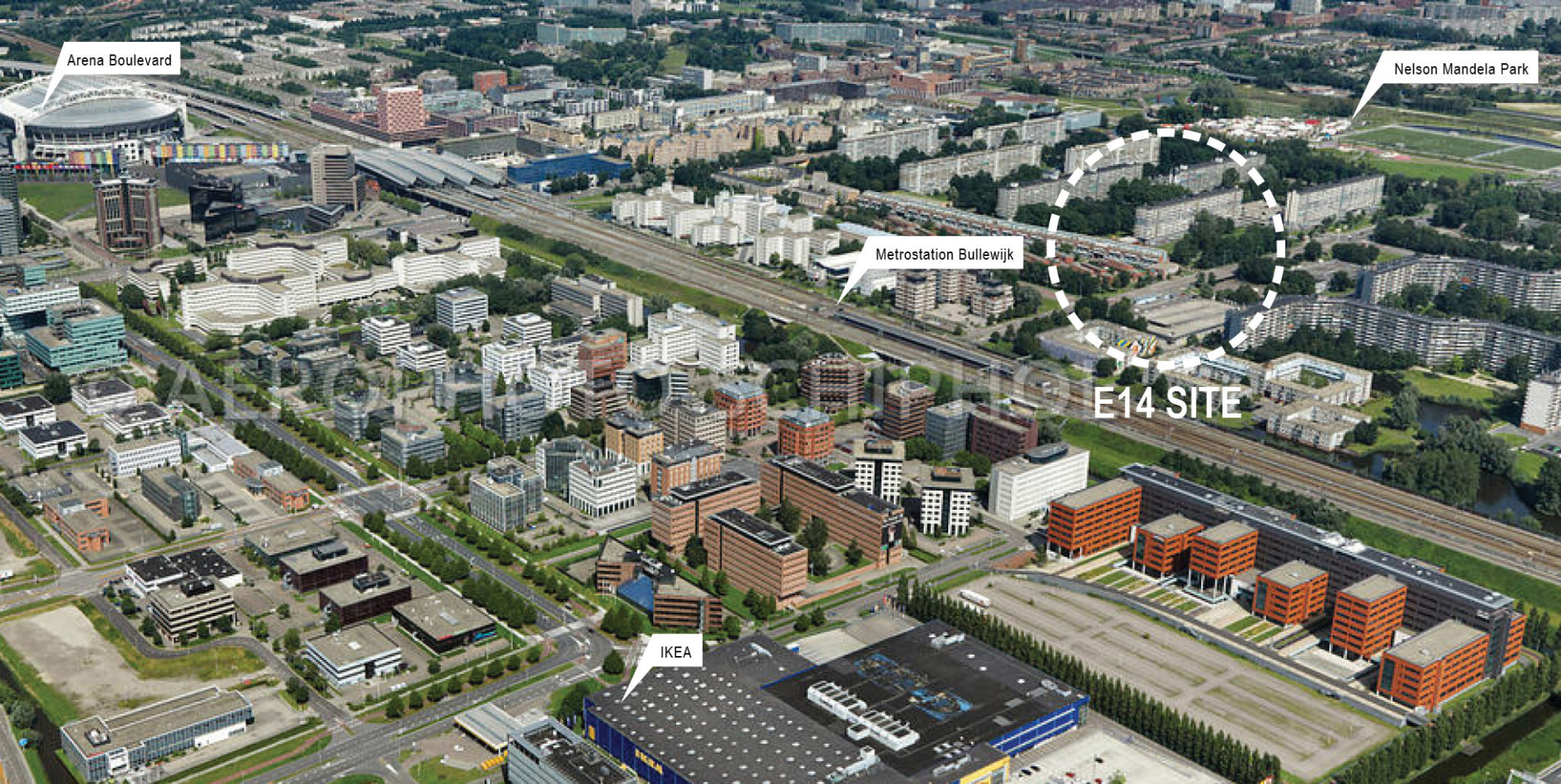
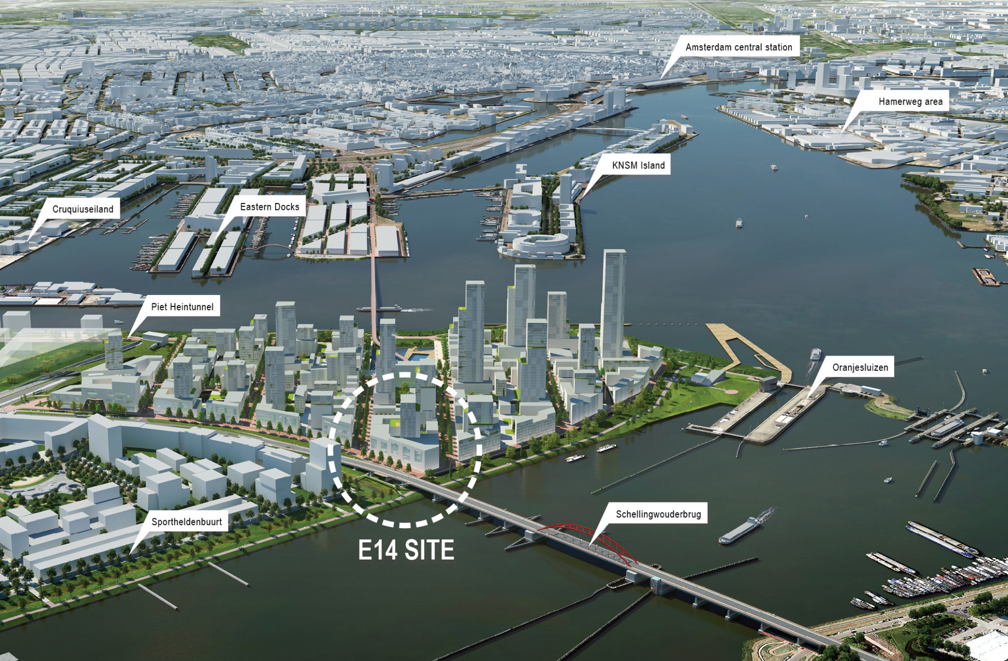
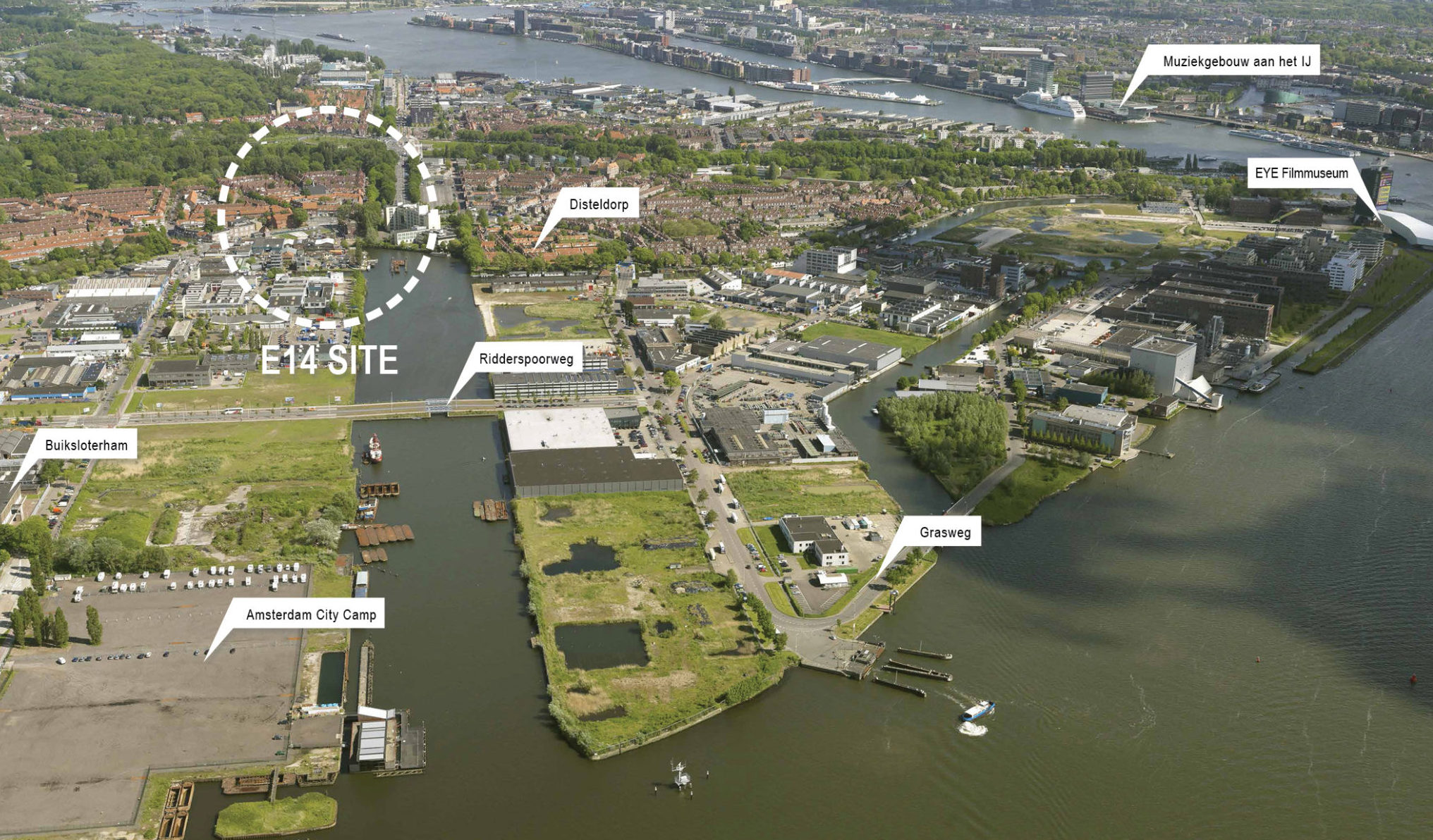
Directly across the water (known as ‘the IJ’) behind Central Station, Papaverdriehoek Noord is a former ship-yard zone adjacent to the Johan van Hasselt kanaal off the river IJ in Amsterdam North. In a portion of this area, in 2012, part of the land was secured for a 10-year lease by the Municipality of Amsterdam after a group of architects won a tender to turn the site into a regenerative urban hub for circular economy. In this sector of the site, a thriving community of entrepreneurs and artists is realizing one of the most unique urban experiments in Europe in terms of sustainable technologies, waste recycling and innovative approaches.


WHAT IS CITY STRATEGY FOR THE AREA?

The site is located in Amsterdam-Noord, which has a different scale and structure than what most outsiders associate with Amsterdam: it is more open, spacious, industrial and raw. The site offers many opportunities to act as a pivot or hinge point between neighbour-hoods in the north and south, and as a gateway to the Buikslo-terham. The study area is characterized by spacious commercial buildings that are rapidly turning into living and working areas (ratio 50:50) where the sturdy industrial character remains. The munic-ipality would like to retain many of the existing businesses in the area after the transformation process has been completed.

MAIN QUESTIONS AND COMPETITION ASSIGNMENT

  1. The assignment for the Papaverdriehoek consists of various parts. In the first instance, the demand is for a design of the project site; the plot owned by Buro Amsterdam. There, the two existing buildings on the plot will be demolished and replaced with one or more building volumes. The proposed ratio between working and living functions is 50:50. A design may express the new ambitions of the Papaverdriehoek: experimental, sustainable, and lively.
  2.  A vision on productivity proposed should be connected to the pivitol role that the site can play in the larger urban context. And what kind of building typologies can fit with these specific productive use? The ruggedness of the area can provide nourishment to the area’s vision, although the romance of the rugged edge is something that needs to be avoided. Supplementary investigations will be required, both in terms of business-economic and social-geographic aspects. It will be wise to supplement the knowledge of the design team with expertise in terms of the circular economy, business economics, and social geography.
  3.  The plot structure of the Papaverdriehoek can play a part of the proposal in its entirety. The municipality has not yet established a vision for the future development of Papaverdriehoek. The proposal for the project site can function as a new model which – perhaps with different plot sizes than the current one. This can be employed as a guide for the transformation for the whole of Papaverdriehoek. Special attention should be given to plot sizes, scale of buildings, built versus un-built, local and supralocal – from small to large
  4.  On an architectural level, its important to reflect on how working and living functions can flow into one another, and have a dynamic relationship with each other and the public space.
  5.  On the study area, phasing scenarios are expected that can support the transformation strategy and desired future image. It is important that various buildings in the Papaverdriehoek are listed to be demolished within a relatively short period. In combination with the temporary use of the parcels, newly-released terrain, and a vacant school (Amsterdamse School Architectuur), there is space for experimentation, temporary use, and relocation operations within the area.

SITE IMAGES

WINNER

Makers Neighbourhood

WINNER

AUTHORS / COLLABORATORS

Alessandro Macaluso (IT), Architect Urbanist
Carlotta Basoli (IT), Landscape Architect
Giovanni Lavanna (IT), Architect
Andrei Deacu (RO), Urban planner

Project Description


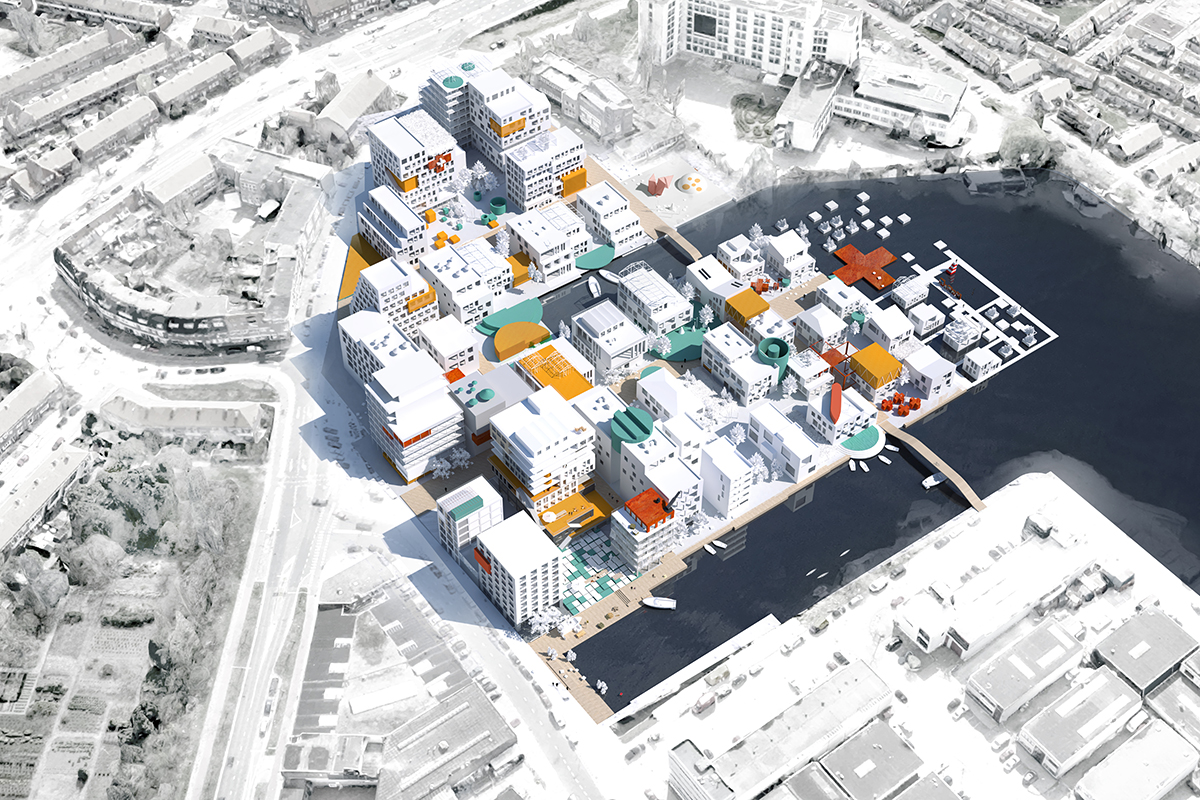
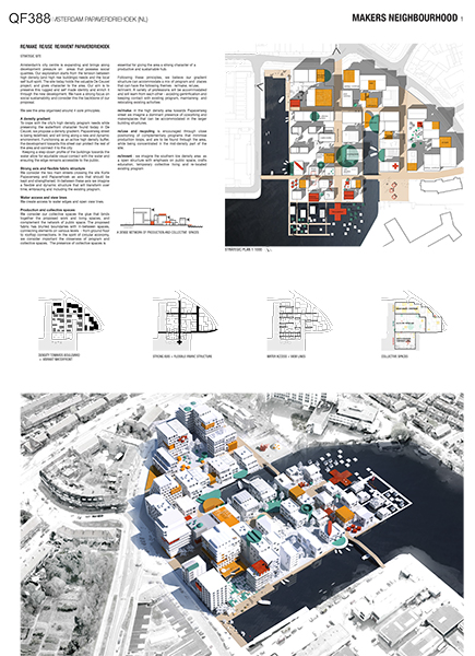
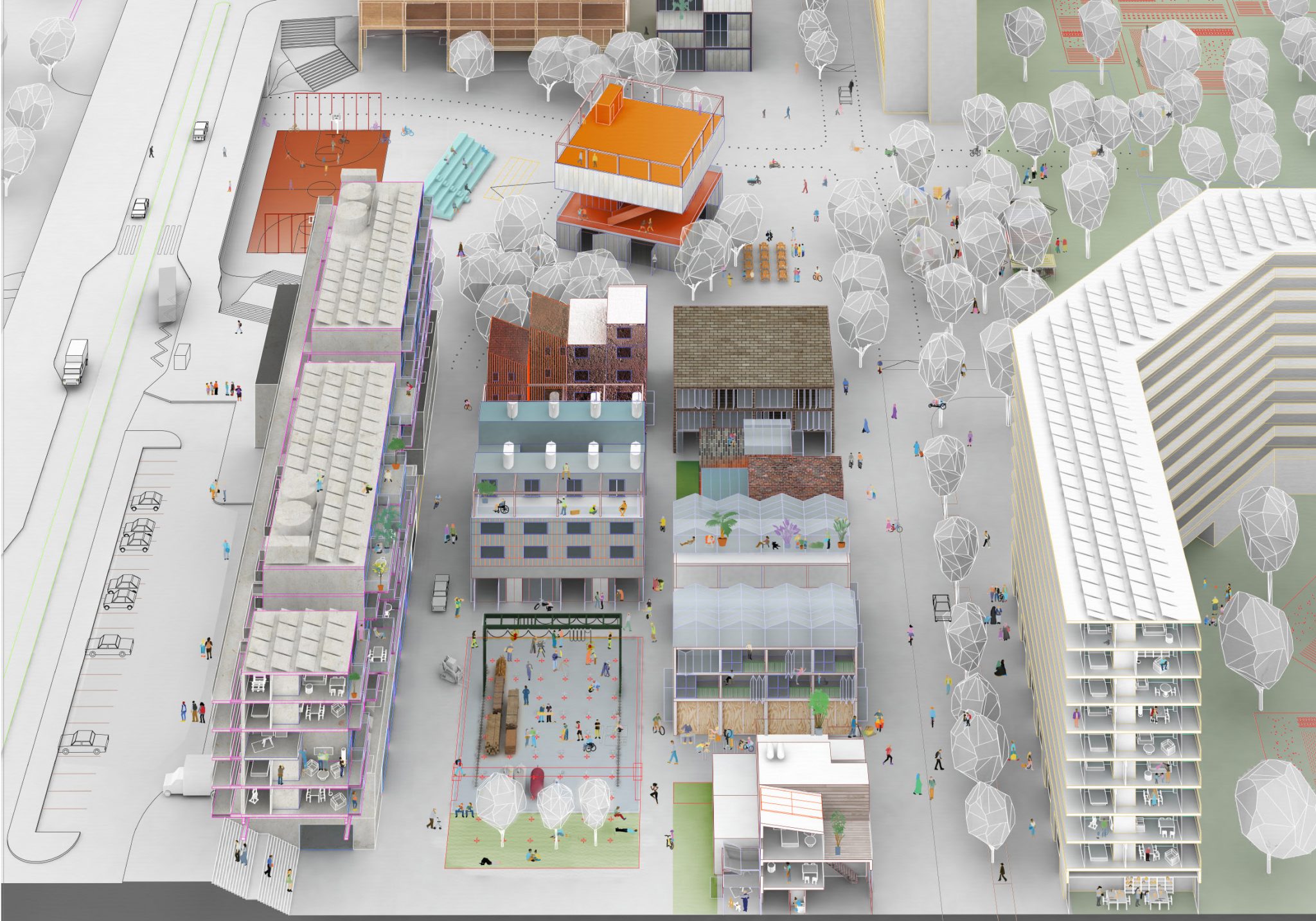
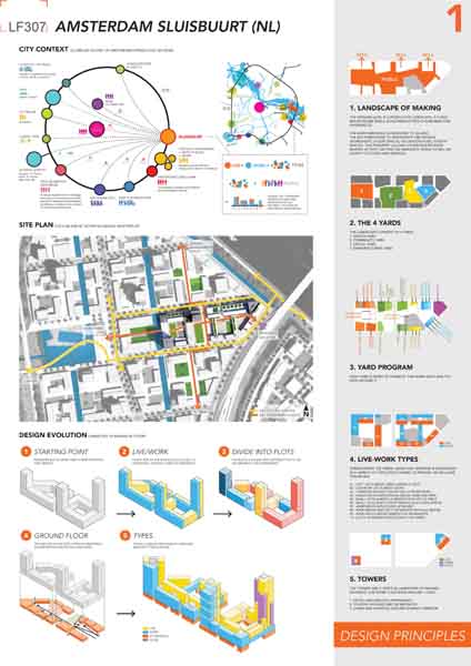
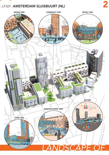
Amsterdam’s city centre is expanding and brings along development pressure on areas that possess social qualities. Our exploration starts from the tension between high density (and high rise buildings) needs and the local self built spirit. The site today holds the valuable De Ceuvel project, and gives character to the area. Our aim is to preserve this rugged and self made identity and enrich it through the new development. We have a strong focus on social sustainability and consider this the backbone of our proposal.

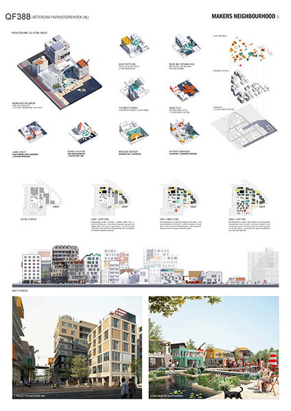
We consider our collective spaces the glue that binds together the proposed work and living spaces, and complement the network of public space. The proposed fabric has blurred boundaries with in-between spaces, connecting elements on various levels - from ground floor to rooftop connections. In the spirit of circular economy, we consider important the closeness of program and collective spaces. The presence of collective spaces is essential for giving the area a strong character of a productive and sustainable hub.

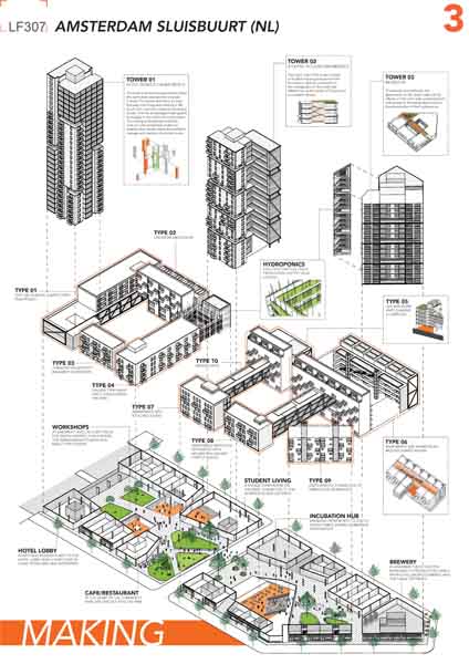
Our proposal is a mix of program and spaces with a strong focus on re/making , re/using re/inventing. A variety of professions will be accommodated and will learn from each other - avoiding gentrification and keeping contact with existing program, maintaining and relocating existing activities.

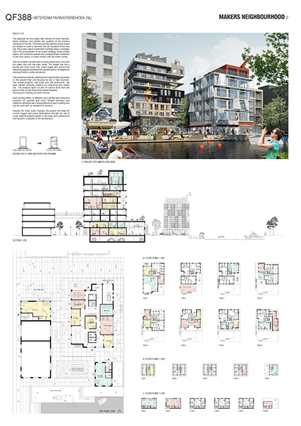
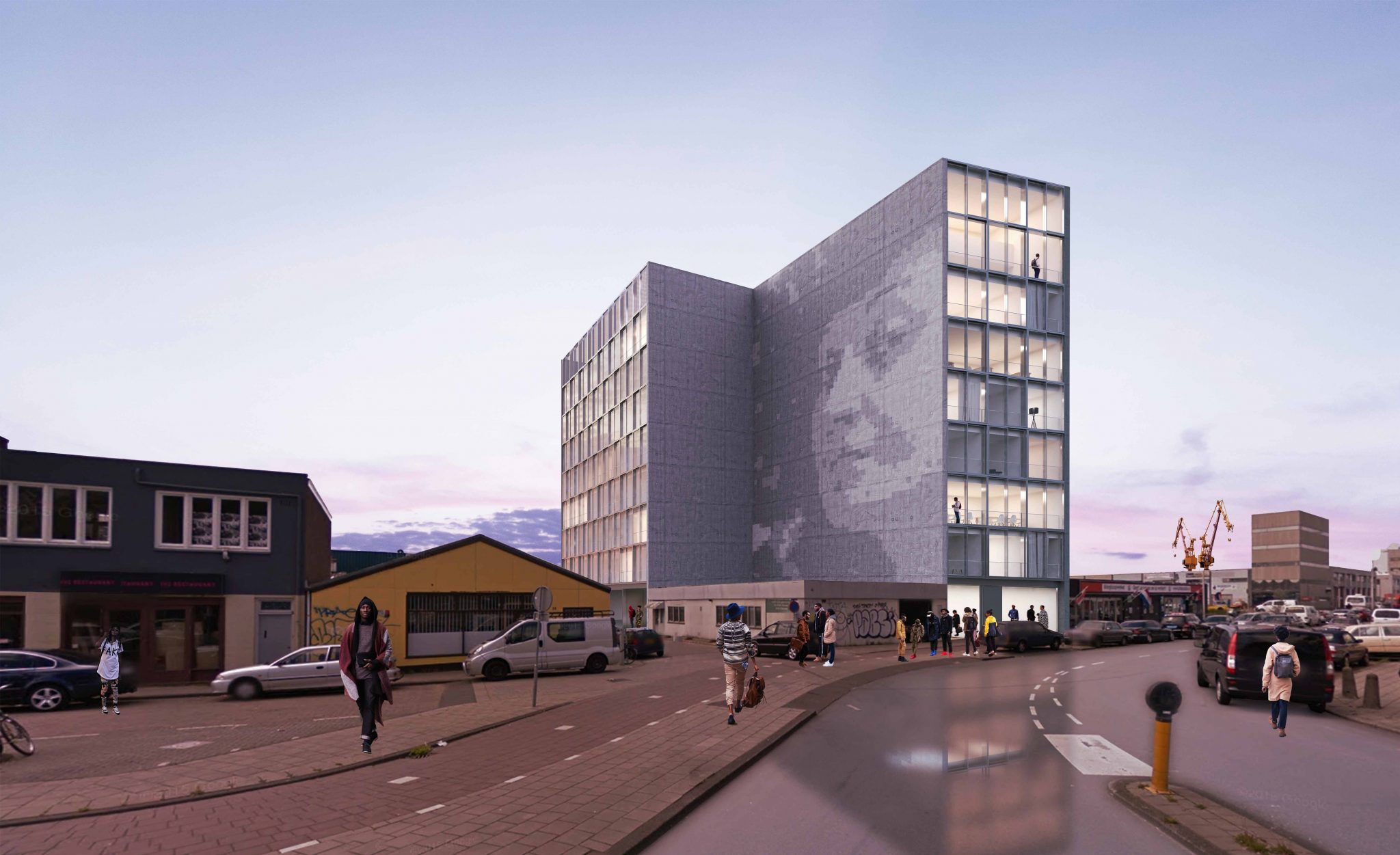
The proposal for the project site consists of three volumes, which embrace and amplify the qualities of the existing character of the site. The three volumes and the public space are shaped in order to become one strong piece of the new city. The public space in between buildings plays a strategic role in the achievement of the overall strategy, where shared space, and collective spaces are a programmatic extension of the inner space, in close contact with the water pocket.

The traditional scheme, where productive activities are placed on the ground floor and housing on top, is here revolved. The overall program, half living and half productive, has been spread vertically, creating an interesting and vibrant mix. The program spills out also on various level, from the ground floor, to the productive shared terraces.
Housing and working activities coexist.

Despite the urban scale changes, the project will keep the current rugged and active atmosphere through the use of rough material already present in the area, and a productive and dynamic character of the architecture.

Jury comments


This project stands out by its clear and strong urban strategy and a system of little squares which function well as public spaces that are well oriented on the sun. it is an intriguing structuring scheme which leads to a beautiful urban scheme. Despite the fact that the link with the different neighborhoods and the alignment along the Papaverweg could be more explicit, this proposal is most in line with the brief and the is the most complete.

An all-round project, which is feasible as a design strategy. Spatially, the development strategy for the transformation of the whole of Papaverdriehoek is very interesting. The feasibility of the proposal and the functioning of the area during the different phases of development, with the possibility to integrate ‘de Ceuvel’ is convincing. The urban scheme shows a good gradient of density and balance in height differences and flexibility between firm guidelines and flexibility in the working out of the plot spaces. In its looseness and preciseness this proposal offers a lot of potentials for the development of the area. Instead of removing the existing productivity of the area this project proposes to integrate these structures by stacking productivity and housing and by integrating existing uses. Features to be worked on further are the alignment with the road and the connection with the different neighborhoods. The possible synergy of the neighborhood and ‘de Ceuvel’ could be more explicit.

Bjarne MASTENBROEK

Ellen HELLSTEN

Jürg DEGEN

Mark RABBIE

Marlies ROHMER

Mattijs VAN RUIJVEN

Olivier MEHEUX

Ruurd GIETEMA

Tania CONCKO

Project Team

Alessandro Macaluso (IT), Architect Urbanist
Carlotta Basoli (IT), Landscape Architect
Giovanni Lavanna (IT), Architect
Andrei Deacu (RO), Urban planner

Contact information

macalusoalessandro@gmail.com

Drakenbergsgatan 8, 11741, Stockholm, SE

RUNNER-UP

Coliving an open neighbourhood

RUNNER-UP

AUTHORS / COLLABORATORS

Vincenzo Tuccillo (IT), Architect
Maria Grazia Panunzio (IT), Architect

Project Description


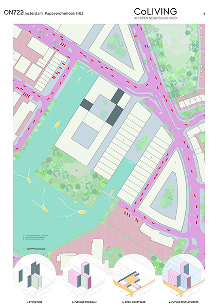
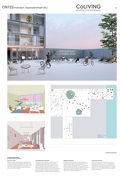
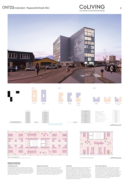
Within an area often characterized by a highly fragmented ownership that therefore implies bizarre plot shapes in the case of plots groupage, the strategy is to fill the borders this way gaining a double benefit: against a future denser urban environment, built limit operates as an interface through which it is possible establishing meaningful connections between “inside” and “outside”. Inner freed up space is the living core of the settlement: conceived as a semi-public space, but at the same time clearly shaped by the architectural volumes, here highly differentiated activities, both extensions of private spheres and public incursions, take place and discover a fertile meeting point. With the aim to be an alternative to traditional dwellings blocks based on nuclear families exclusive presence here a diversified and colourful three - dimensional mix of uses happens. Due to the extremely flexible typology a further design phase would aim to support a well-balanced coexistence of ateliers, co-housings, home/office, family houses at all the blocks levels. Being occupancy by young people sharing a house the most likely in a close future, at least at the beginning, the hypothized dwelling layouts are mainly intended for them. Even if flexibility could support many alternatives, central idea is always to provide restrained but comfortable private areas that open up on generous and vibrant communal zones where meeting and sharing life. Limiting load-bearing vertical structures to external areas completely frees up internal space and makes it apt to accommodate easily very different layouts according to quick changes in real estate market during the development phase, multifaceted customers’ life styles and various social models, needs updating over time. Sandwich floors integrating all ductwork - here including warming and cooling systems - guarantee free uses of spaces. Indeed, what mostly restrains the use of a space to a predetermined scheme is often the position of infrastructures. Above-mentioned features makes houses resembling more and more to offices and this perfectly fits the ongoing trend that sees these two fields overlapping. By strengthening the role of communal areas within the units, this proposal envisions that these spaces could act also as home co-working areas for young people sharing a residence.

Jury comments


This proposal is convincing due to its strong, seductive (architectural) image which the jury see as an intelligent statement for ‘marking’ the area with a building which points on the opportunities for further developments. On the other hand, this proposal does not provide a convincing image on the urban scale and is missing a thoughtful development strategy for the site which makes a wider development possible. It is not clearly explained how this scheme could be realised. It’s an intriguing development for the first site to start having an interesting concept system of closed courtyards to be developed in phases. This creates public space which is very introvert, and linked to the quality of the building itself. But this space does not link to the surrounding spaces, which is important for the overall functioning of the area as a whole.

Choosing for this strategy would also mean that the imposed structure is very strict and has almost no flexibility for other developments in the future. The jury finds this a contradicting project which invites participation, while leaving details and all possibilities open. The lack of urban strategy and the flexibility/neutrality/openness of the design approach could be both a strength and a weakness

Bjarne MASTENBROEK

Ellen HELLSTEN

Jürg DEGEN

Mark RABBIE

Marlies ROHMER

Mattijs VAN RUIJVEN

Olivier MEHEUX

Ruurd GIETEMA

Tania CONCKO

Project Team

Vincenzo Tuccillo (IT), Architect
Maria Grazia Panunzio (IT), Architect

Contact information

vincenzotuccillo@hotmail.it

Via Museo Giovio 1, 22100, Como, Italy

SHORT LISTED

Mixxxing Noord

SHORT LISTED

AUTHORS / COLLABORATORS

Jose Ramon Vives (ES), Architect
Jose Nunez Gimeno (ES), Architect
Laura Riaño (ES), Architect

Project Description


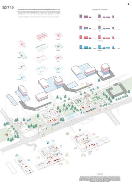
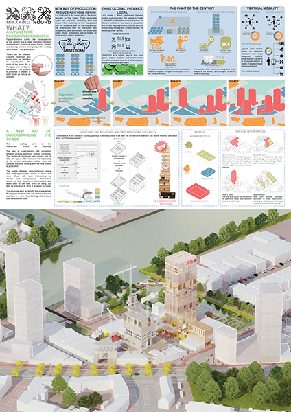
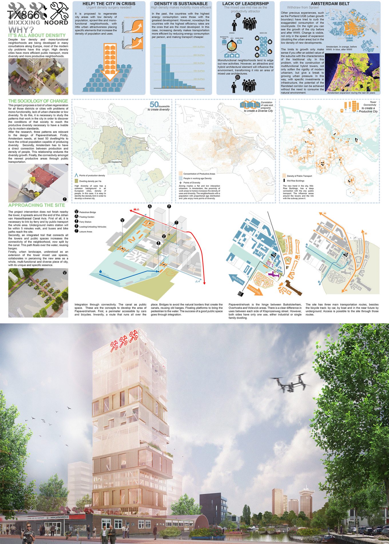
MIXXXING is a tool of urban regeneration for all those districts with problems of mono-functionality, lack of urban character and low diversity. Mixed-use towers act as acupuncture needles. Obsolete buildings and empty plots are identified as opportunities. The plinth of the tower fills in the gaps and configures the streets. This process is proposed in phases to ensure its natural development.
The urban landscape, understood as an extension of the tower mixed-use spaces, collaborates in perceiving the new area as a whole, multi-functional and diverse piece of city, with its unique and specific essence. Mono-functional neighbourhoods tend to edge out new activities. However, an attractive and hybrid architectural element will influence the environment, transforming it into a more efficient urban setting. An integrated trail that connects all the towers and public spaces increases the connectivity of the neighbourhood, now split by the canal.

In the past, the countries with the highest energy consumption were those with the greatest development. However, nowadays the countries with the highest efficiency rates are the ones that are the most developed. Increasing density makes transportation more efficient by reducing energy consumption per person, and making transport cheaper.

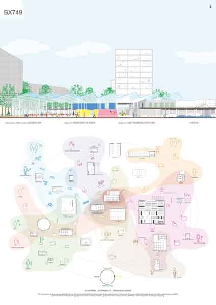
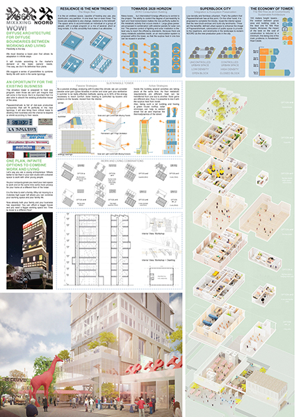
The tower hosts the whole productive circle: production, trading and recycling. Three sub-cycles are proposed: workshops, food and leisure. Let’s create a direct relationship between product and consumer. A market on street level works as an attractor.

The starting point for the tower is flexibility. The way of understanding the correlation between working and living evolves constantly. Traditional typologies are expiring. The border between personal/leisure space and working/productive space is more and more diffuse. Architecture should not only adapt itself to the new forms of living, but also be prepared to what it is about to come. We develop a basic plan flexible enough to adapt in any way. A new urban typology: the shoebox tower. This tower will mutate in time according to the market’s demand or the owner’s need.

We believe in MIXXXING NOORD’s capacity to productively, socially and environmentally diversify the decaying urban fabric.

Jury comments


This project proposes a smart, high-rise development strategy to kick-start the urban redevelopment process, which also means a high return for the one who is first investing in the area. The setup of the urban spaces is interesting, with an emphasis on high density while engaging in productivity and keeping the exiting environment. The jury finds this an intriguing proposal but not a winner, questioning the tower as solution to distribute the components in a smart way as well as it’s effect on availability of sunlight for other parts of the plan area. It can be one off solution with in the plan area. For these reasons, this proposal is not sufficient enough as a building or urban strategy.

Bjarne MASTENBROEK

Ellen HELLSTEN

Jürg DEGEN

Mark RABBIE

Marlies ROHMER

Mattijs VAN RUIJVEN

Olivier MEHEUX

Ruurd GIETEMA

Tania CONCKO

Project Team

Jose Ramon Vives (ES), Architect
Jose Nunez Gimeno (ES), Architect
Laura Riaño (ES), Architect

Contact information

joseramonvives@gmail.com

Ruysdaelkade 209, 1072 AW, Amsterdam, NL

Produ(A)ctive Papaverdriehoek

SHORT LISTED

AUTHORS / COLLABORATORS

Nash Roy (IT), Architect
Astorri Luca (IT), Architect

Project Description


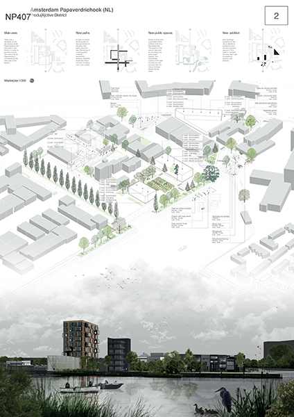
Our work on “Produ(A)ctive district” starts from existing development analysis. The new buildings on the area are based on the idea of the circular economy (CE) and are multifunctional. Municipality doesn’t have a clear strategy for each zone. We included spare zones in our CE project as a possibility to develop a productive district. By enlarging the strategic area, we create land-use based economy and intensive production.

Wide space along the Johan van Hasseltkanaal used for placing sourcing production for the new system. It is based on growing plants in order to give the materials to the new artisans in the district, gardens and orchards provide food. The system of new plantations is regulated by supporting biodiversity corridor along the canal. It connects water transitional eco system with existing urban fringe.
The CE that we propose on this site starts with described sourcing and continues with manufacture, which includes processes from treatment base materials to the local production in wooden laboratories, arts and crafts, multifunctional workshops located on a main site given by the brief. The part of distribution is based on existing connections on the area and on planned by municipality. Different storages for materials and production sites are available by roads and new water connections. The new inhabitants are meant to use and participate in the CE. We provide new accommodation for them, new services and facilities, major part of which is connected to our CE.
The main production process can be described as a part of this circle. Starting from planting sources, coming ingathering. Then treating and storing materials before final production and selling. Leftovers are transformed into compost and help to support fertility of the soil on production lands.

Korte Papaverweg became the main axis of the system. In order to increase the quality of connection, we renew existing paths, create connection between Veldbiesstraat and Papaverhoek, bringing new cycle routes. This network connects new public spaces.
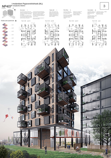
Besides the main plot, we provide three buildings, functions of which are related to described CE. One part of the main building is allocated to research laboratories, co-workings and workshops. Another one is housing for new inhabitants. Buildings functions are recognizable by use of different languages for façade. The interesting part of housing is “rotating” plans and supporting green elements as extended “green houses”.

Jury comments


This proposal shows an interesting approach on sustainability and urban green, developed with a focus on productive green. The proposed landscape structure is connected with its surroundings on a larger scale and operates as a biodiversity corridor in relation with the urban water system. The jury values this approach but thinks that the phasing is not realistic. The jury is not convinced by density of the proposal for the site. Despite the fact that the plan is focused on productive green strategies the ground floor hardly shows any synergy with the wider structure of public spaces. Also, there are some doubts if the proposed architectural appearance is fitting in the area.

Bjarne MASTENBROEK

Ellen HELLSTEN

Jürg DEGEN

Mark RABBIE

Marlies ROHMER

Mattijs VAN RUIJVEN

Olivier MEHEUX

Ruurd GIETEMA

Tania CONCKO

Project Team

Nash Roy (IT), Architect
Astorri Luca (IT), Architect

Contact information

r.nash@p-u-r-a.com

Via Birago 2, 20133, Milano, IT

SUM+ Papaverdriehoek Kwartier

SHORT LISTED

AUTHORS / COLLABORATORS

Fabrizia Berlingieri (IT), Architect Urbanist
Federica Greco (IT), Architect
Mario Covello (IT), Architect
Elisa Vanzillotta (IT), Architect
Rossella Ciacci (IT), Environmentalist

Project Description


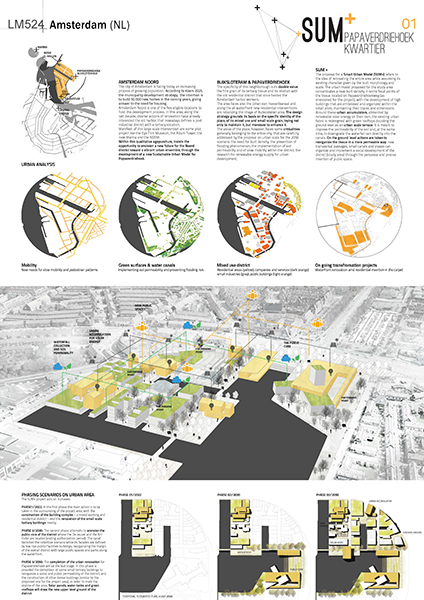
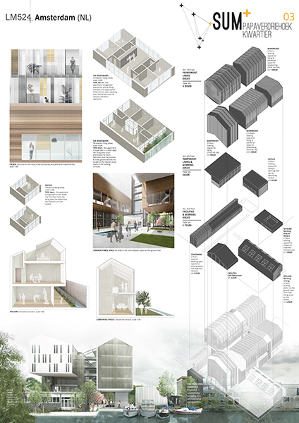
AMSTERDAM NOORD. The city of Amsterdam is facing today an increasing process of growing population. According to Koers 2025, the municipality development strategy, the intention is to build 50.000 new homes in the coming years, giving answer to the need for housing. Amsterdam Noord is one of the five eligible locations to host the development process. Within this qualitative agopuncture program, insists the opportunity to envision a new future for the Noord district toward a vibrant urban ensemble, through the development of a new Sustainable Urban Model for Papaverdriehoek.

PAPAVERDRIEHOEK. The specificity of this neighborough is its double value: the fine grain of its tertiary tissue and its relation with the old residential district that once hosted the Amsterdam harbor workers. The design strategy grounds its basis on the specific identity of the place, of its mixed use and small scale grain, trying not only to maintain it, but moreover to enhance it. The place, however, faces some criticalities generally belonging to the entire city, that are carefully addressed by the proposal on urban scale for the 2050 scenario: the need for built density; the prevention of flooding phenomenon; the implementation of soil permeability and of slow mobility within the district; the research for renewable energy supply for urban development.

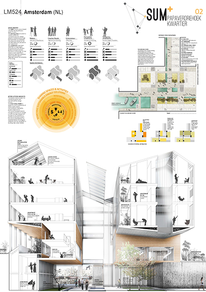
SUM+. The proposal for a Smart Urban Model (SUM+) refers to the idea of renovating the entire area while assuming its existing character given by the built morphology and scale. The urban model proposed for the study area concentrates a new built density in some focal points of the tissue located on Papaverdriehoekweg (as envisioned for the project), with the development of high buildings that are embebbed and organized within the small plots, maintaining their traces and dimensions. Around these urban accumulators, alimented by renewable solar energy on their skin, the existing urban fabric is redesigned with green rooftops doubling the ground level as an urban scale terrace. It is meant to improve the permeability of the soil and, at the same time, to downgrade the waterfall rain directly into the canals. On the ground level actions are taken to reorganize the tissue in a more permeable way: new transversal passages, small canals and plazas can organize and implement a social development of the district (study area) through the pervasive and precise insertion of public space. The SUM+ project scenario acts on 3 phases:
2022. Ma

Jury comments


This project is interesting in the way the public space and the waterfront are developed and in the way existing buildings are integrated in the different phases. It tries to keep the small scale of the current situation and by doing so introduces good spatial qualities. They use a (romantic) stamp which is not pretentious and matches well with the existing, with a quite low density. The jury has questions if this is enough to give a strong impulse for the development of the whole area.

Bjarne MASTENBROEK

Ellen HELLSTEN

Jürg DEGEN

Mark RABBIE

Marlies ROHMER

Mattijs VAN RUIJVEN

Olivier MEHEUX

Ruurd GIETEMA

Tania CONCKO

Project Team

Fabrizia Berlingieri (IT), Architect Urbanist
Federica Greco (IT), Architect
Mario Covello (IT), Architect
Elisa Vanzillotta (IT), Architect
Rossella Ciacci (IT), Environmentalist

Contact information

info@berlingieriarchitetti.it

Piazza Della Liberta, 87036, Rendo, IT

Living and working, a new urban ecology

SHORT LISTED

AUTHORS / COLLABORATORS

Francesca Rizzetto (IT), Architect Urbanist
Marco Galasso (NL), Architect
Chiara Cirrone (IT), Architect

Francesca Vanelli (IT), Architect

Project Description


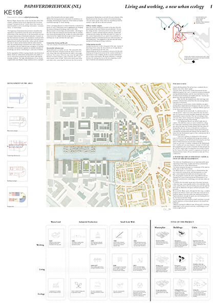
Recent studies have identified the wish to share one’s living environment with like-minded people and the working space, so various social groups can live and work side by side in relatively small clusters, in a durable way. This trend stimulates both social cohesion and strong network of small and medium companies.

The project aims to stimulate existing qualities in the area by proposing simple actions and integrating them with a strategic enriched program to attract new users on working and living.

Papaverdriehoek is seen as part of a system, in which the water could become a central square. A bike line circumnavigating it, unifies the different neighborhoods and creates in its trace different small public spaces.
In the design area, property fragmentations are seen as an opportunity for diversification, the area will start to change through the Collective Private Commission. Buildings is already defined but some guidelines are proposed to give the freedom to owners and inhabitants to build together the future houses.

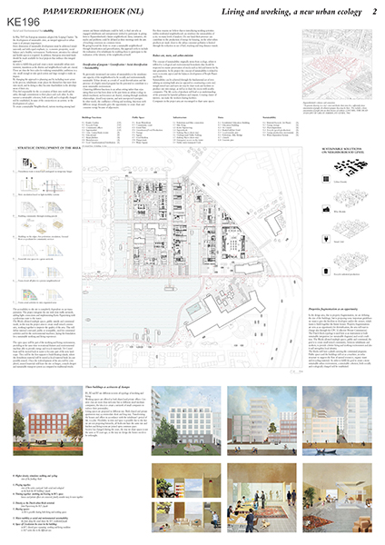
The Dutch block typology is used here as an instrument to both sustainable integration and social condition. It allows multiple spaces, public and communal to provide a better living and working environment and also strengthening local identity. A plinth is carrying the communal programs. Public spaces and the buildings will act as a machine, an infrastructure to support the flow of natural resources, organic waste and recycling materials. In order to fulfill the goal to create a more sustainable urban environment, a sustainable cohesion, both socially and ecologically charged will be established.

The three buildings are the activator of change in the area, B1, B2 and B3 are different in term ofworking and living typology.
Offices are offered as both shared and private. Creative class and different small medium business will create a network of small companies to enforce their potentiality.

Living spaces are proposed in different size. Both shared and private apartments may accommodate short and long stay. Transforming the houses and offices in accordance with the inhabitant’s period of life, is a plus. Flexibility in time and space is possible due to the fact we are not proposing hierarchy, all bedroom have the same size and kitchen and living room are joined open common space. Society has changed during the years, the way we share spaces is not the same as 50 years ago, so the way we design the houses needs to be rethought.

Jury comments


This plan is very convincing in its connection with the neighboring sites, having an interesting urban layout. Although the plan is very detailed in restructuring the whole site with a clear phasing, the development strategy itself is not clear. It is developable, but is this enough? The ‘masterplan’ is very fixed, not intriguing and obvious with much emphasize on the architecture and pretty pictures without thinking about the synergy between the volumes.


Bjarne MASTENBROEK

Ellen HELLSTEN

Jürg DEGEN

Mark RABBIE

Marlies ROHMER

Mattijs VAN RUIJVEN

Olivier MEHEUX

Ruurd GIETEMA

Tania CONCKO

Project Team

Francesca Rizzetto (IT), Architect Urbanist
Marco Galasso (NL), Architect
Chiara Cirrone (IT), Architect

Francesca Vanelli (IT), Architect

Contact information

rizzettofrancesca@gmail.com

Noordmolenstraat 44b, 3035 RK, Rotterdam, NL

Transformatorweg

Read more about the site brief

Scale: mall / Urban Architecture

Team representative: Architects, Urbanist

Site family:

Location: Transformatorweg, Amsterdam

Population: Amsterdam: 835.000

Study area: 9.40 Ha

Project site: 2.16 Ha

Site provided by: City of Amsterdam

Actor(s) involved: City of Amsterdam, Mediacollage

Owner(s) of the site: City of Amsterdam

Prizes: 1st Prize €12,000, Runner-up €6,000, Special mentions

SITE DEFINITION

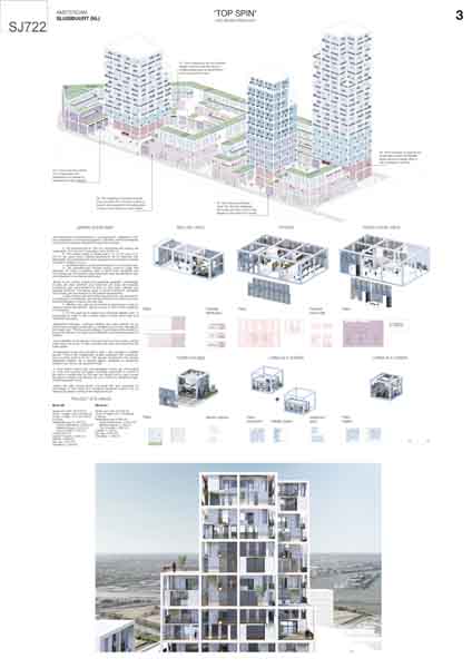
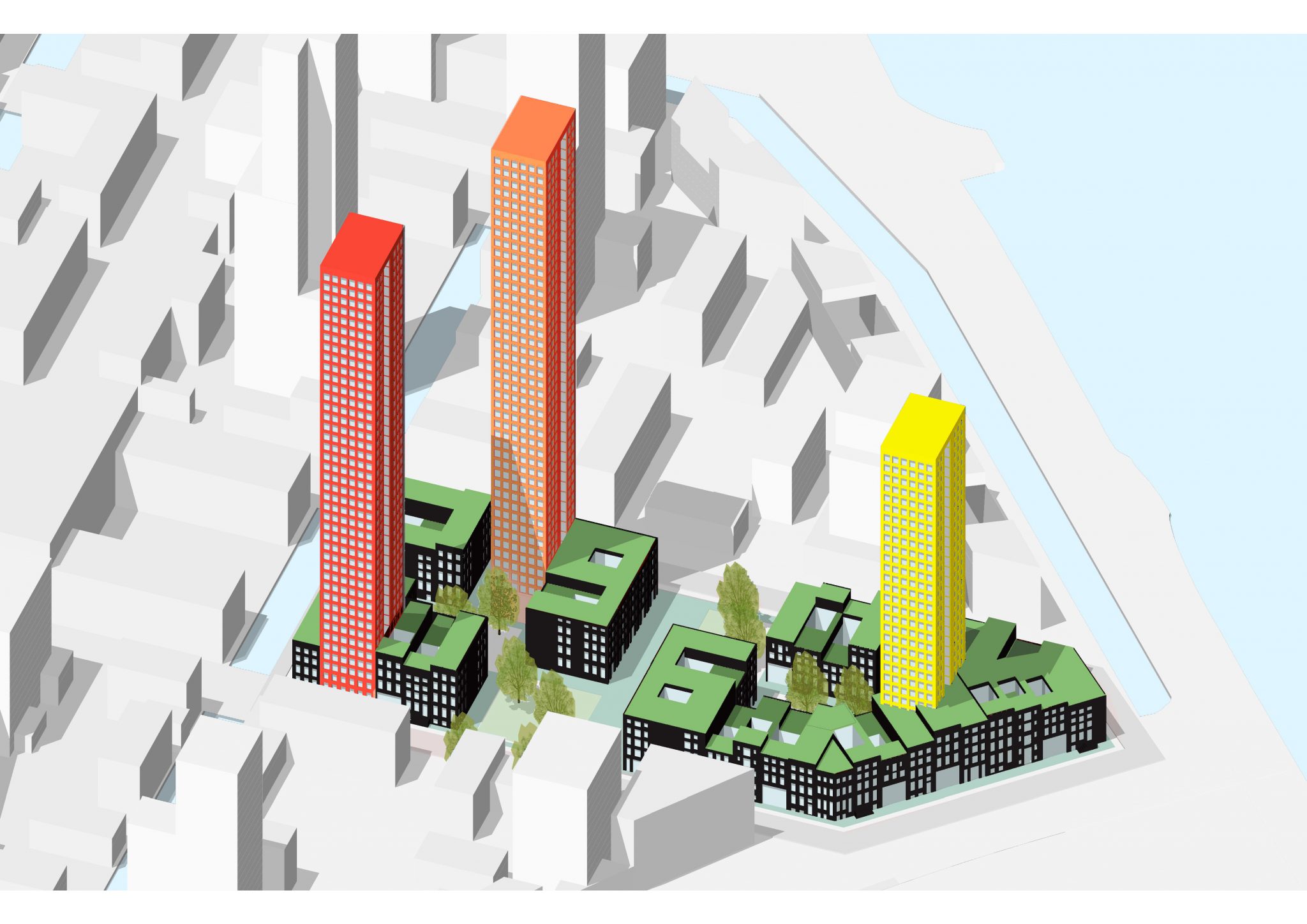
The location Transformatorweg is part of one of the (five) blocks of the planning area Sloterdijk I South. Despite the various port-related activities, the area has a mono-functional character with a strong emphasis on the car. There are very few examples of intensive urban development. The study area is bordered by rail tracks and private allotments in the south, undefined green space to the east. But change is coming. The highway to the north will be re-profiled and light-industrial buildings in the west will be replaced by mixed-use residential neighbourhood. As it stands, the area feels like a ‘non-place’. This is the fundamental challenge set by the competition.

WHAT IS CITY STRATEGY FOR THE AREA?

The site is located in Sloterdijk 1 development plan, an area in the eastern part of Amsterdam’s Port-City where in the long term, 40,000 homes will be built by 2040. The municipality wants to transform and convert this area into a coherent mixed-use urban district. Initially, the municipality is focusing on the area between Transformatorweg and railway tracks which will, over time, become a mix of living, working, educational and commercial facilities. The municipality wants to develop the area together with the existing owners and users. The first steps in this collaboration process has just started. 4,500 new homes will be realised in Sloterdijk 1 by 2025.

MAIN QUESTIONS AND COMPETITION ASSIGNMENT

  1.  Provide an architectural design for the project site, which balances the expansion ambitions of the Mediacollege, and those of the municipality who wish to intensify its location. The proposal should add living and working program, which helps to ensure that the location can function as a gateway for Sloterdijk.
  2.  The project site consists of two plots. The Mediacollege is located on one plot; the undeveloped land between the Mediacollage and Transformatorweg, owned by the municipality, is the second plot. The advantage of two separate ownerships is that buildings can be developed independently. With mutual agreement for the coordination and construction, the continuing functioning of the Mediacollege can be assured. The second advantage is that the two plots together provide opportunities for a better interpretation of the site’s potential in its entirety. For example, housing (student housing or for other groups) may be situated above the education building, and there could be larger flexibility for developing the new additions in phases. Programs can be temporary relocated so long as the Mediacollege, as an institution, can continue to function. Attention should be paid to the fact that the Mediacollege’s current building is still relatively new.The phasing of new additions and various development scenarios should be clearly argued and represents a final image of the design proposal. There is a need to overcome possible tensions between the two stakeholders, by proposing an effective, inspiring and convincing end image of a combined realisation that can benefit both parties.
  3.  On the study area, a vision of the public space is demanded in relation to the Transformatorweg location design. It is expected that work includes an analysis of how the site can function better as a gateway for Sloterdijk I. Designers are asked to illustrate their design proposals respecting existing conditions. Currently Contactweg is strongly focused on car traffic. A vision of an attractive public space is required that can function as a place to stay. Car and bicycle traffic (including parking provisions) must still continue to be able to make use of the street.The study area is bordered by different conditions to the north, south, east and west and each border condition presents both challenges and opportunities. For example, how might the plinth of future mainly residential buildings to the west be orientated and/or designed to enhance business synergies with the Mediacollege? To the north, the city is busy with a new framework plan that will narrow the profile of Contactweg, releasing land for more park-like spaces. What role could these spaces have? To the east, there are opportunities to connect to Amsterdam’s famous Westerpark.

SITE IMAGES
WINNER

Media Sloboda

WINNER

AUTHORS / COLLABORATORS

Aleksandr Zinovev (RU), Architect
Budarin Konstantin (EE), Journalist
Shmeleva Irina (RU), Architect

Dimitrii Andreev (RU), Movie Director
Elmira Kakabeava (KZ), Public Relations and Education

Project Description


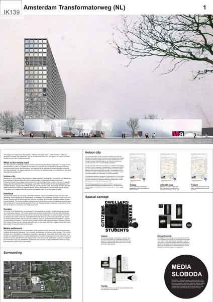
What is the media hub?
The development in Sloterdijk I South requires transforming the MediaCollege plot. The logic of this transformation is clear. It is based on the vision of a compact city composed of densely built multifunctional urban blocks. But the thing is, our objective is no restricted to augmenting the university with new buildings. The vaster objective is to transform the MediaCollege into a MediaHub. But what does MediaHub stand for?

Indoor city
MediaHub is not a building. We propose to cease using the building as a minimal city unit. MediaHub is a collection of spaces that offer various opportunities for education as well as for work. Following Google Indoor Maps, we transition from the building-function scale to the level of specific spaces and the opportunities those spaces could offer.

Interface
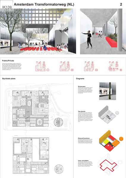
The tool that makes the hub open is the Web Interface. The hub architecture does not work independently. It only serves as an infrastructure, a necessary but insufficient condition of the hub's functioning. Spaces and the technology they host are a toolbox, and the Web interface enables accessing that toolbox. The virtual interface is augmented by a physical complex of display window facades that are placed in the key shared spaces of the hub. Display windows create the visual drama of the hub as the spot for education and media production.

Curator
The value of the MediaHub is not restricted to the possibility to create a multifunctional space that can incessantly produce. The curator determines how the infrastructure of the hub will materialize. The curator is an expert that works with the hub as an art-residence or a creative cluster. Curator determines what the hub is. The mission of the hub can change year after year. In any case, the hub is a place that doesn't operate by itself. It must be tuned by the curator.

Media settlement
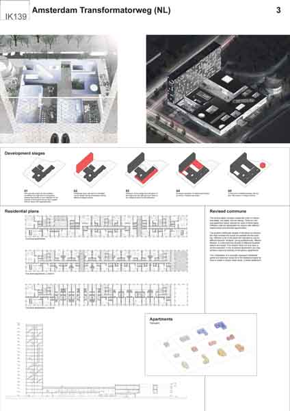
The architecture of the hub is a combination of the vertical and the horizontal. The horizontal plane contains all productive elements - the university, workplaces, commerce, public spaces. The vertical is a residential plane. It houses apartments of various configuration that can make homes for people of various requirements and opportunities. The value of the apartments, however, is linked to the horizontal of the hub. Residential spaces and the hub form a media settlement meant for those that value the content of the urban block.

Jury comments


The jury finds this a promising proposal, as it is very specific in terms of program and in the appearance of the building. The project establishes a cluster of new interventions, where existing and new functions are combined in distinct building volumes. The proposed building cluster establishes new visual, functional and movement connections its surroundings while creating a nice interior world with interesting spatial configurations on the ground level and second floor.

The scheme is about creating synergy between form and program which is then brought back to one strong image which could function well as catalyst for the future development of the area. The jury appreciates the proposals on how the interactive program could be managed. The jury misses a stronger connection between the housing with the program of the plinth and feels that the impact of noise on the residential accommodation has not been addressed. This proposal has significant consequences for the existing buildings of the Media College.

Bjarne MASTENBROEK

Ellen HELLSTEN

Jürg DEGEN

Mark RABBIE

Marlies ROHMER

Mattijs VAN RUIJVEN

Olivier MEHEUX

Ruurd GIETEMA

Tania CONCKO

Project Team

Aleksandr Zinovev (RU), Architect
Budarin Konstantin (EE), Journalist
Shmeleva Irina (RU), Architect

Dimitrii Andreev (RU), Movie Director
Elmira Kakabeava (KZ), Public Relations and Education

Contact information

mail@alexanderzinoviev.com

Via Della Rosa 8, 50122, Florence, IT

RUNNER-UP

Embracing Technology

RUNNER-UP

AUTHORS / COLLABORATORS

Oscar Linares de la torre (ES), Architect

Bernat Bastardas Llabot (ES), Student in Architecture
Guillem Rius Manuel (ES), Student in Architecture
Maria Del Olmo Gomez (ES), Student in Architecture

Project Description


Understanding the Media College as a catalyst for education and technology, the proposal intends to translate the potential of the creative thinking that is taught in the classrooms to every aspect of daily life.

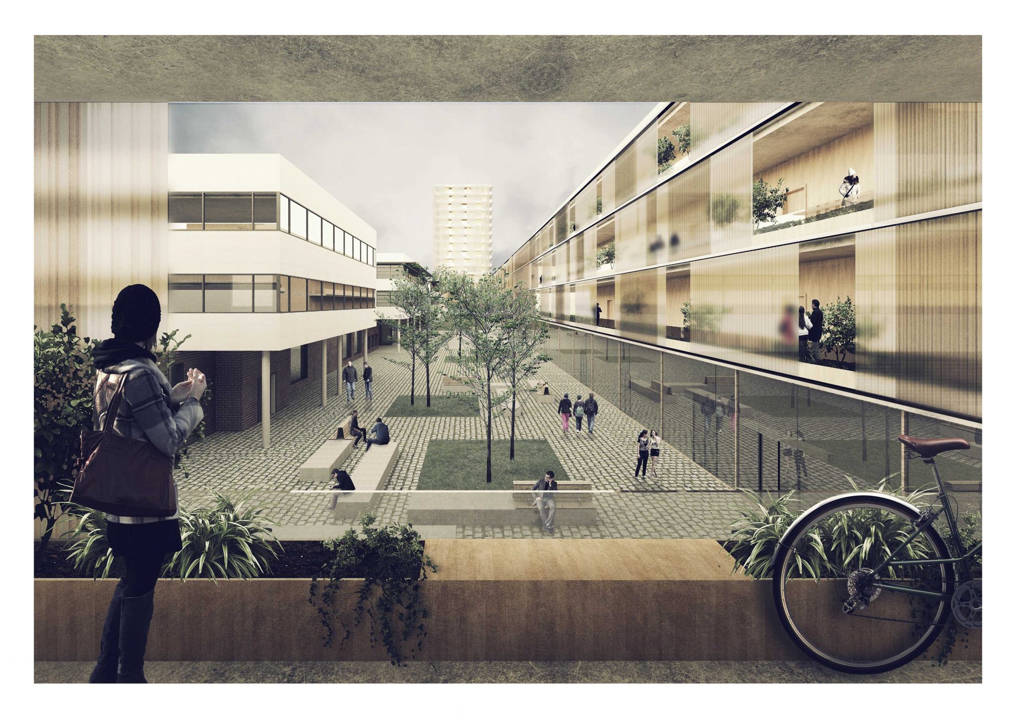
Under the current situation, the Media College is a heterogeneous building lacking of a unified image, due to the process of addition in which it has been built over the years. The aim of this project is to provide a unified language and logic with the new construction without touching the existing building. Moreover, this strategy allows the Media College to function without changes through the several construction phases.

Therefore, the proposal is a building that surrounds the existent, embracing the Media College and unifying the whole ensemble through its architecture. This unity is achieved through a translucent polycarbonate façade, related with the usage of new materials and the technological program. In addition, this double skin façade has an efficient environmental behaviour and responds to the sustainability requirements.

In terms of urban planning, this strategy allows the building to control and adjust the urban space. This intervention proposes a wide range of public spaces with different characters.

Firstly, a wide open space it is created at the north east corner, where there can be concerts, bicycle parking space is provided and the different users can interact with the city. Secondly, there is an interstitial space between the old and the new building that becomes a threshold between uses. Finally, the external space that faces the street is redesigned in order to have a wider sidewalk and reduce car traffic.

In conclusion, the proposal condenses living, working and learning all together in a single building, where the mixture of uses is seen as the main attraction to this area. The students of the College can rent an apartment in the new building, learning from entrepreneurs that can have their productive space close to their home, in a building specifically thought to integrate singles, families, young couples and social houses that can even be adapted for the elderly.

We strongly think this interaction among users benefits the community as a whole. Thus, the building is designed for a contemporary way of living, where a new model of city is proposed, which strength is on the mixture, and where education and technology are placed in the centre, with a whole building embracing the future.

Jury comments


In the emptiness of its surroundings, this proposal is a radical redefinition of the cluster with a perimeter block that defines clear edges, opens up connections to the park and embraces the existing the Media College structure. The proposed tower doesn’t block the views to and from the Transformatorweg. The jury is convinced by the way the building complex opens towards the park and strengthens connections between different kinds of public space and the transitional, differentiated spaces in between. The jury feels that the interaction of new proposal and the ground floor of the Media College is not that clear.

Bjarne MASTENBROEK

Ellen HELLSTEN

Jürg DEGEN

Mark RABBIE

Marlies ROHMER

Mattijs VAN RUIJVEN

Olivier MEHEUX

Ruurd GIETEMA

Tania CONCKO

Project Team

Oscar Linares de la torre (ES), Architect

Bernat Bastardas Llabot (ES), Student in Architecture
Guillem Rius Manuel (ES), Student in Architecture
Maria Del Olmo Gomez (ES), Student in Architecture

Contact information

oscar.linares@upc.edu

Avenida de la Ciudad de Barcelona 190 3o1a, 28007, Madrid, ES

SHORT LISTED

Media Epcenter

SHORT LISTED

AUTHORS / COLLABORATORS

Haiko Cornelissen (NL), Architect

Project Description


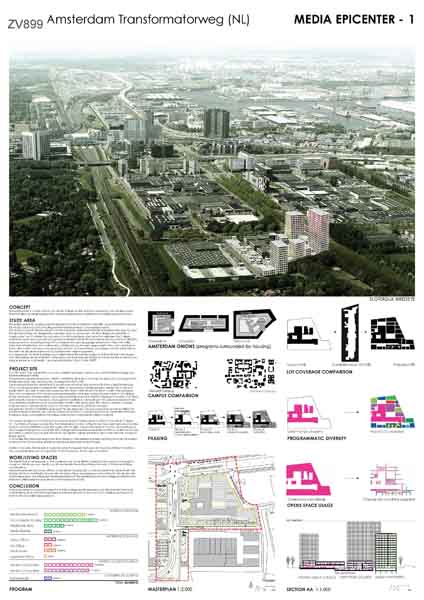
Our Media Epicenter proposal is a vision of how the expansion of the Media College can catalyze urban transformation by melding education and entrepreneurship into a creative production hub.

Successful academic and business campuses deliberately maximize chance encounters. We designed diverse streetscapes that maximize the interaction between the College, residential, work and commercial programs.
The future infrastructure axis on the north, activity park on the west, quiet street in the south, and typical Dutch dike on the east are connected by a network of internal streets and plazas to foster a rich interaction between city, neighborhood, and programs.

We envision an iconic creative melting pot tailored around the Media College and Media entrepreneurship. The Media Epicenter expands on the creative force of the Media College by offering a variety of Media work/living combinations. The integration and transparency of the residential, work and college programs maximize the density and frequency of interactions.

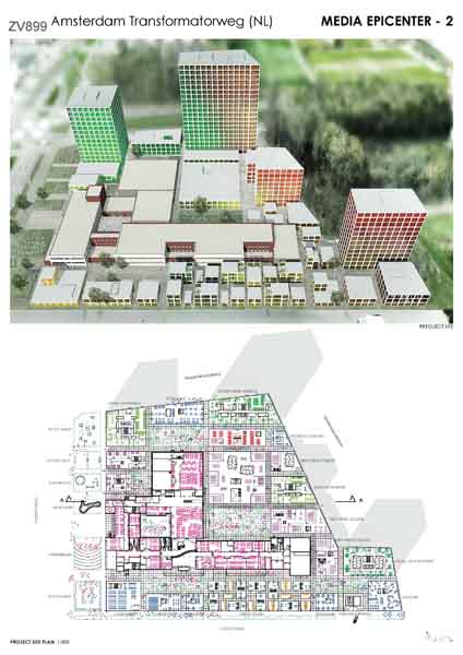
The proposed lot coverage mimics the typical lot coverage of the Amsterdam inner city (~ 70%), and wraps the Media College with housing in an open grid network to facilitate interaction between all programs, culminating in the various plazas which are surrounded by Media functions and activities.

The tallest buildings are located at the northern edge as an extension of the density around Sloterdijk Station and reinforce the Transformatorweg as gateway to Sloterdijk I, as envisioned by the City in “Koers 2025”. All new College areas are located on the current Media College lot. Two Media College volumes that created dead-ends have been replaced with a more efficient volume. The new and existing Media College buildings form one entity with a single central entrance and exit, and the extensions of the Media College are connected with an underground hallway.
Our Media Epicenter proposal is adaptable and sustainable. Our phasing prioritizes the Media extension, but the grid provides flexibility, permitting the phasing to be altered as needed. Our proposal promotes sustainability through minimal energy consumption and timber construction to minimize its carbon footprint.

Media Epicenter is a proposal in which the Media College and its expansion are densified with live/work combinations and commercial program in a flexible process to form an iconic creative melting pot to kickstart the Sloterdijk I development.

Jury comments


Here, the strategy is to densify the site with small functional and spatial intervention in order to create a campus. The scheme is easy to build in phases. It’s an intriguing project, the organization is smart but the small-scale massing is doubtful and inefficient and the appearance of the proposal seems quite generic.

For the jury, it is not evident that the Media College could function well in this scheme due to the lack of spatial hierarchy and clarity

Bjarne MASTENBROEK

Ellen HELLSTEN

Jürg DEGEN

Mark RABBIE

Marlies ROHMER

Mattijs VAN RUIJVEN

Olivier MEHEUX

Ruurd GIETEMA

Tania CONCKO

Project Team

Haiko Cornelissen (NL), Architect

Contact information

haikoc@gmail.com

34-18 Northern Blvd, 11101, Long Island City, US

Framing Transformation

SHORT LISTED

AUTHORS / COLLABORATORS

Carolina Schippers (NL), Architect

Project Description


FRAMING TRANSFORMATION

URBAN STRATEGY

The objective of the project is to embrace the adaptive character and spatial quality of the existing Sloterdijk area and the Mediacollege ensemble.
We therefore propose to create a campus of buildings composed of concrete frames and a steel infill. The buildings are independent entities forming an urban ensemble allowing for different development timelines as well as creating a rich in-between urban space.

Framing the school with a living & working zone
The Mediacollege building has a strong L-shaped organization towards to southwest of the site with the interior Mediaplein at its core. The proposal is to add a counterpart to the northeast. A combination of living, working and educational spaces activating also the current “back” of the school.

Creating a new urban square
By adding this couterpart development to the northwest a new urban space is created. A lively urban square framed on all sides. A meetingspace for students and future residents with the potential to host larger scale events to communicate the work of the students with a broader audience.

Creating MaLab
The Mediacollege is launching a number of initatives to better prepare its students for their future careers. Most of them such as MaIncubator focus on a more open and collaborative way of working and supporting entrepreneurship.
In its current building these activities are not easy to house. We therefore propose MaLab a space consisting of a number of intersecting frames. This creates a variety of ceiling height and large span spaces to facilitate for instance production of movies and performances and large scale installations.

Creating a network of small scale open spaces
Apart from the central Mediasquare the ensemble of volumes also creates a varietly of smaller scale spaces that are interconnected. This creates new public pedestrian and cycle passages from the Spaarndammerdijk and Westerpark into Sloterdijk I. On the outside the ensemble responds to different conditions by opening up - towards the planned Contactweg park - or closing in - towards the traffic of Transformatorweg.

Jury comments


This project is an interesting modular system that offers a lot of flexibility for the Media College. The voids and glass elements in architecture are vague and lack some degree of hierarchy. It is nice project but it is a bit too generic.

Bjarne MASTENBROEK

Ellen HELLSTEN

Jürg DEGEN

Mark RABBIE

Marlies ROHMER

Mattijs VAN RUIJVEN

Olivier MEHEUX

Ruurd GIETEMA

Tania CONCKO

Project Team

Carolina Schippers (NL), Architect

Contact information

carolienschippers@gmail.com

Korenschoofstraat 195, 3513 DE, Utrecht, NL

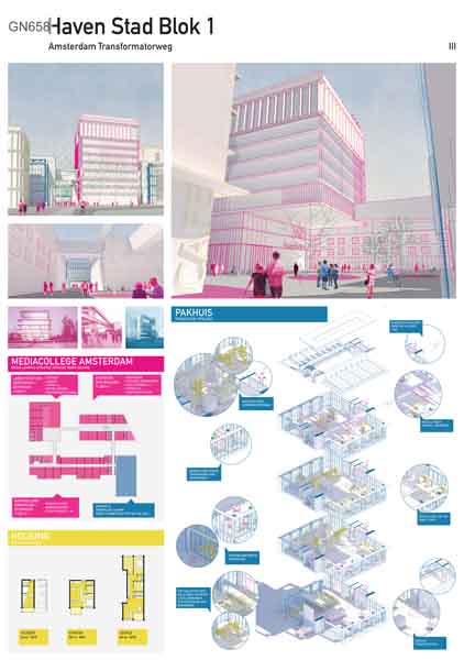
Haven Stad Blok 1

SHORT LISTED

AUTHORS / COLLABORATORS

Wouter Keizer (NL), Architect
Ule Koopmans (NL), Architect
Remko van der Vorm (NL), Architect

Project Description


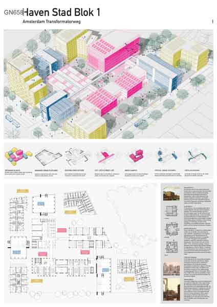
INCLUSIVE CITY
The city’s chain of production will be constantly changing and productive businesses will keep on specializing. Future urban factories have cleaner production methods, are smaller because of just-in-time manufacturing and are vertical organized; resulting in a potential engine of urban revitalization.

SLOTERDIJK I
A monotonous, non accessible urban fabric represented by a flat and closed production typology. This current typology requires a lot of circulation space, is very introvert and results in deserted streets. To accommodate a gradual shift from a monofunctional to a lively mixed district an urban model is needed that enables phased relocation of the existing typology. A model that includes small-scaledness, accessibility and open, extrovert plinths without losing its productive character.

HAVEN STAD BLOK 1
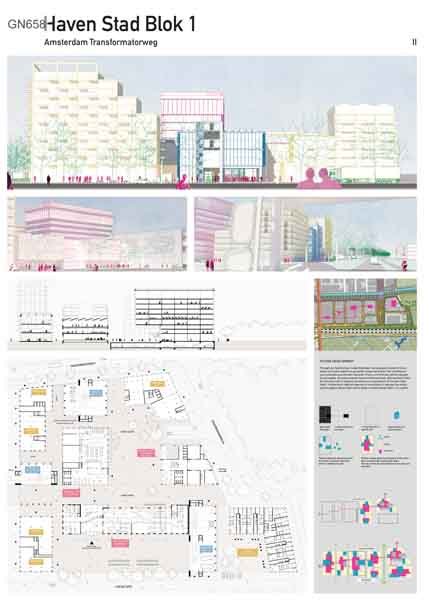
Haven Stad Blok 1 is based on a hybrid urban model: we set simple rules (marking the outer plotlines, integrating an inner square and opening up the block) that allow for different typologies and uses to cooperate on one plot. We oppose the superblock (problems regarding relocation, nuisance, phasing etc.) and combine this set of rules with a -new- production typology: Pakhuis. Because of the required high density, Pakhuis is integrated as a vertical ‘factory’ in between the housing blocks. Each function has it’s own connection to the street and contributes to a lively neighbourhood where various functions meet.

TYPOLOGY: PAKHUIS
In the desired mix for Haven Stad we believe production should be experienced. Highly transparent volumes allow residents to get involved in the production process: consumption of production. Based on the old Amsterdam warehouses, the Pakhuis has its vertical transport on the visible outside creating big open floors on the inside. With a floor height of 6m and the possibility to open up floors, any given production business can be accommodated.

MEDIACAMPUS
The Media College has a specific program that can easily be integrated in the urban model. By relocating several functions to the high new extension at the Spaarndammerdijk, the Mediacollege becomes a campus around the inner square. Interaction with the residents and production units is stimulated through the inner street and square. With a direct connection to Pakhuis III the alumni are stimulated to live and work on the plot and use it's facilities when starting their own bussiness.

Jury comments


This project demonstrates interesting ideas on how to set up a mixed-use, lively urban environment. It proposes to transform the Media College by creating a new building in the center of the site, surrounded by supporting program. For the jury, the connections between spaces in between the buildings are diffuse and not clearly defined

Bjarne MASTENBROEK

Ellen HELLSTEN

Jürg DEGEN

Mark RABBIE

Marlies ROHMER

Mattijs VAN RUIJVEN

Olivier MEHEUX

Ruurd GIETEMA

Tania CONCKO

Project Team

Wouter Keizer (NL), Architect
Ule Koopmans (NL), Architect
Remko van der Vorm (NL), Architect

Contact information

wkeizer@gmail.com

Nassaukade 301-3, 1053 LN, Amsterdam, NL

H-Buurt

Read more about the site brief

Scale: Small / Urban Architecture

Team representative: Architects, Urban planner

Site family:

Location: H-buurt, Amsterdam

Population: Amsterdam: 835.000

Study area: 36 Ha

Project site: 2,9 Ha

Site provided by: City of Amsterdam

Actor(s) involved: City of Amsterdam

Owner(s) of the site: City of Amsterdam

Prizes: 1st Prize €12,000, Runner-up €6,000, Special mentions

SITE DEFINITION

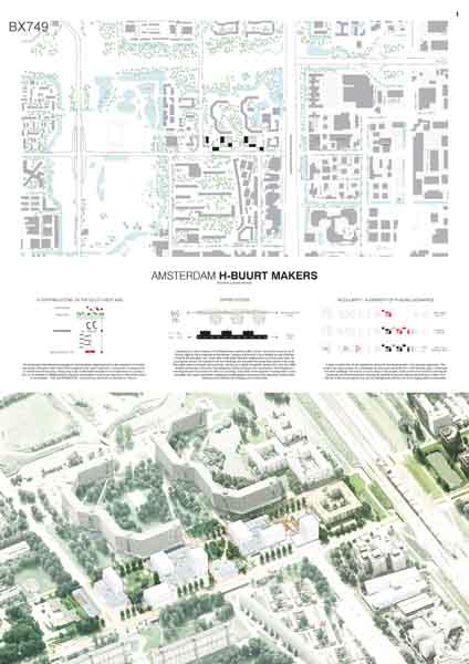
The H-Buurt is a small community of about 7500 inhabitants and is one of the districts of the Bijlmer, which was built in the 1960s following the functional ideas of CIAM and Le Corbusier that proposed to separate working areas from residential areas. Today, the neighbourhood is characterised by a mix of 1960s high-rise buildings and 1980s low-rise buildings set within a landscape with mature trees, areas of water and open spaces for parks. Traces of the CIAM philosophy on mobility still exist: cars, bicycles and pedestrians are clearly separated. The area has good connections to the city centre by Amsterdam’s metro line and has good connections to the city periphery by car, bus and bicycle.

WHAT IS CITY STRATEGY FOR THE AREA?

The site is located in Amsterdam Zuid-Oost, an area characterized by mono-functional residential neighbourhoods and office undergoing transformation. High-rise residential buildings have been demolished and replaced by new blocks with a more human scale. Before the financial crisis, the municipality subsidised socially inclusive projects. In the current development model, the city would like to partner with developers to find new ways to safeguard strategies that can protect and nurture inclusive urban development. There is a desire to change the mono-functional area into mixed live/work neighbourhood that can foster the low-income economy.

MAIN QUESTIONS AND COMPETITION ASSIGNMENT

  1. The main assignment is on the project site. Here the Hakfort parking building is currently under review by the municpality and awaiting decision if it will be demolished and replaced by an alternative building typology and functional mix in which living and working can coexist. The assignment is to propose an architectural design that replace the Hakfort parking building. A second parking building also be demolished and redeveloped. This creates opportunities to propose a new cluster of buildings on the project site, in which low-end productivity can be fostered and encouraged. We look forward to see solutions that can start a new vision of combination between urbanity and productivity. This includes other investment flows, perhaps a different economy, a different architecture and a different future.
  2. The assignment also requires a seduction strategy to attract developers and private investment. In the current development model, the municipality would like to partner with developers to find new ways to safeguard strategies that can protect and nurture inclusive urban development. The municipality desires to create a mixed-use neighbourhood that can support the low-income economy. Therefore, the proposed typology needs to address the issue of cost effectiveness through its functional organisation, programmatic innovation and construction logic. Resourcefulness is required. Flexible building construction, options for expanding residences or business spaces at a later point in time, cheap building methods; these are just a few of the options which could help make the project financially viable. What type of work and living spaces could be considered desirable for the developers? Can the revenue generated by the housing lead to affordable workspaces? Or can the building(s) be designed by considering different built qualities within the building to achieve overall cost-effectiveness?
  3. The public space can play a role in enhancing the productivity while making it visible and promoting social cohesion. The demand is for a vision that connects the building volumes to the public space. The intention is for the public space to play a role in the productivity of the neighbourhood. Consider, for example, vegetable gardens, of which the harvest can be sold in the new buildings and surroundings. The well-used and socially important playground must be incorporated in the design. The social safety of the slow-moving traffic routes – pedestrians and cyclists – that run through the area are also an important point for the municipality. Proposals for this must be included in the design.

SITE IMAGES
WINNER

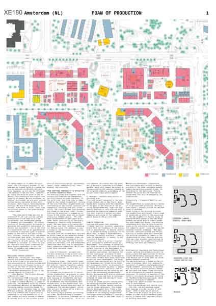
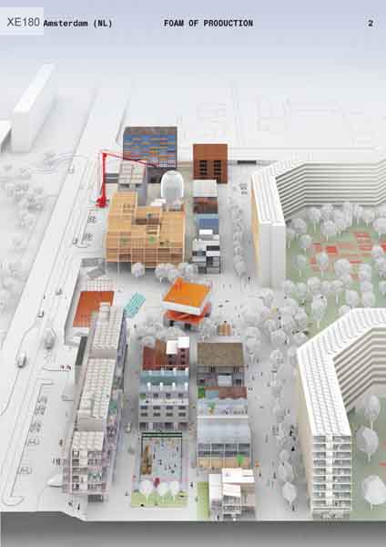
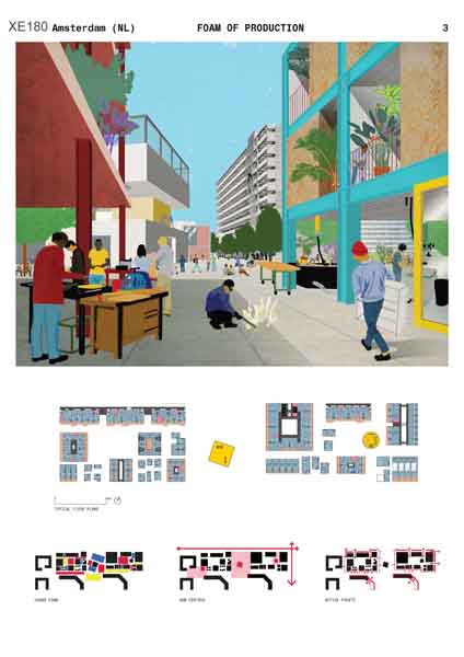
Foam of Production

WINNER

AUTHORS / COLLABORATORS

Timur Shabaev (NL), Architect
Timur Karimullin (NL), Urban Planner

Sofia Koutsenko (US), Interior Architect
Maria Krasnova (NL), Artist
Kristina Knauf (DE), Urban Planner

Project Description


RESILIENCE THROUGH DIVERSITY

“Modularity, versatility, and adaptability are prized features that need to be prioritized in an uncertain and fast-evolving world. Diverse systems with many connections and scales are more resilient in the face of external shocks than systems built simply for efficiency – throughput maximization driven to the extreme results in fragility.” (Ken Webster, The Circular Economy: A Wealth of Flows)

The functionalist CIAM principles come to life in the model city of Bijlmer. It was a triumph of simple efficiency in times of stability. The movement could not foresee the heightened efficiency as impediment to fostering complex diversity needed for resilience in the unstable times to come.   With our proposal, we aim to address the resulting undefined and fragile site by preparing it for the possibility of a new, nimble and savvy economy to emerge. An economy built on the circular principles of long-lasting design, maintenance, repair, reuse, remanufacturing, refurbishing, and recycling.

Jury comments


This project has been unanimously voted the best proposal. The plan is interesting in that it proposes a solution that functions at different scales and with different typologies, with a clear and well defined collective space in the center of the plan. It proposes a clear hierarchy of urban spaces and city blocks, set within an loose organisational structure that allow for different types of uses. The system of flexible blocks is adaptable and can allow for different phasing ideas. This scheme is creating opportunities for entrepreneurs or private ownership situations. The proposed interventions offer undefined space as a reaction to the overly defined space which is considered one of the problems of the Bijlmer. The project is productive because it is ‘forever young’ and focused on the future. It somehow brings optimism and facilitates user participation without being to ‘closed’ to the community.

Bjarne MASTENBROEK

Ellen HELLSTEN

Jürg DEGEN

Mark RABBIE

Marlies ROHMER

Mattijs VAN RUIJVEN

Olivier MEHEUX

Ruurd GIETEMA

Tania CONCKO

Project Team

Timur Shabaev (NL), Architect
Timur Karimullin (NL), Urban Planner

Sofia Koutsenko (US), Interior Architect
Maria Krasnova (NL), Artist
Kristina Knauf (DE), Urban Planner

Contact information

office@d-r-o-m.com

Borgesiusstraat 27B-2, 3038 TB, Rotterdam, NL

RUNNER-UP

Buurtmakers

RUNNER-UP

AUTHORS / COLLABORATORS

Arie Gruijters (NL), Architect
Mircea Munteanu (BE), Architect Urbanist
Ryosuke Yago (JP), Architect Urbanist

Project Description


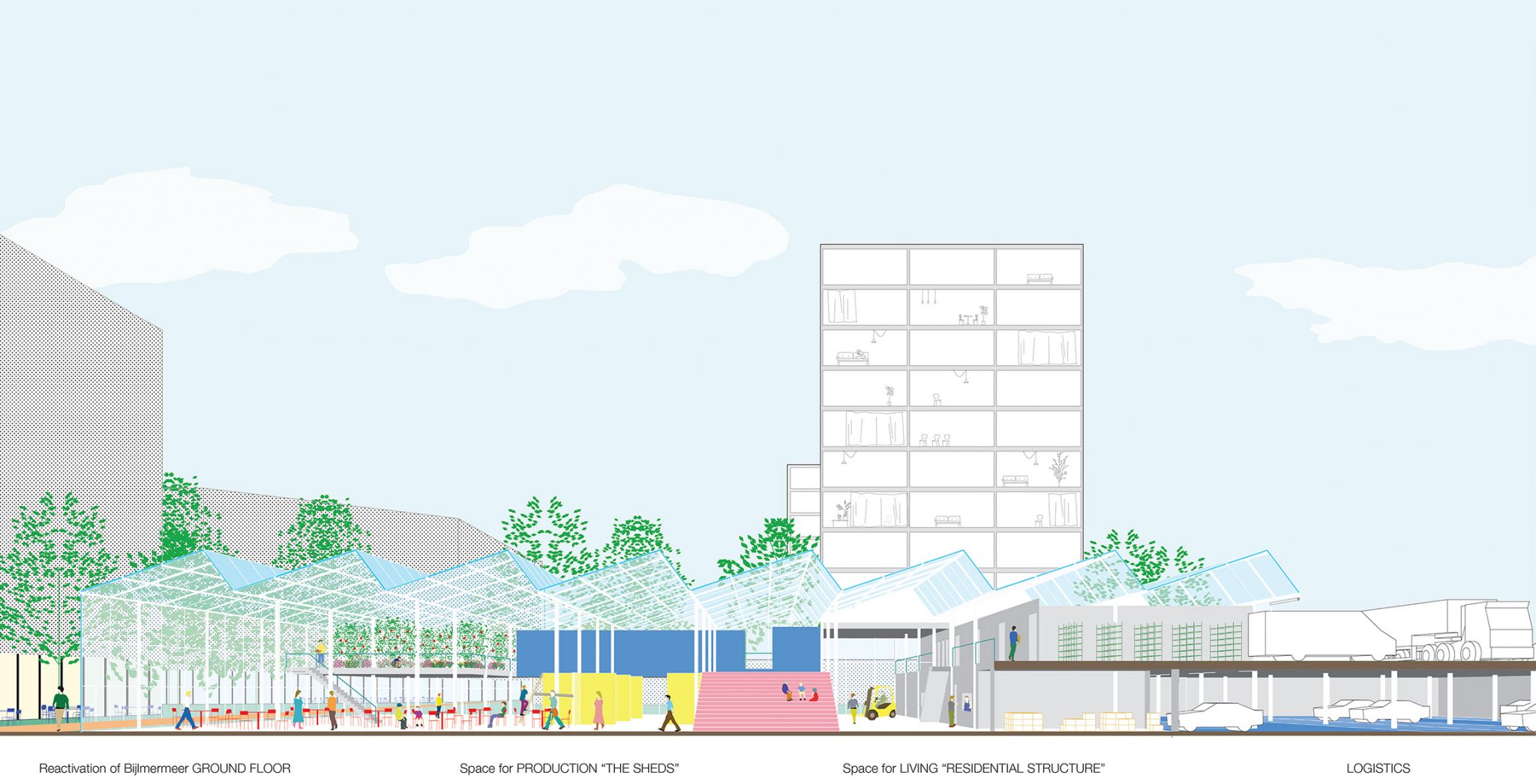
The project is an individualized stepping stone in the sequence of diverse encounters along the metro-line and the adjacent south-west soft axis. Composed of a mix of middle-income housing sitting atop a set of affordable incubators of production, the strip becomes a brand name in Amsterdam, BUURTMAKERS, synonymous with local production in H-Buurt.

Capitalising on the potential of Bijlmermeer’s stacked traffic system, 2-story boxes are built directly against the broadened embankment, creating a filter and car-oriented interface. The other three sides face the neighbourhood on the lower level. The public space defined by the spaced boxes contracts and expands, cutting out a series of specific spaces from the non-differentiated landscape. Moreover, the pedestrian areas continues into the interiors, embedding the structures in their surroundings, while the plinth of the adjacent housing slabs is also activated with public amenities, fostering local initiative and bridging the social divide.

A base module with all the ingredients allows for the development to be phased organically. The project works also as a precedent for the broader strip: Amstel III’s commercial structures being transformed into housing can have productive spaces retroactively added to them, strengthening the Buurtmakers identity.
The apartments and co-housing units enrich the housing stock of the Bijlmermeer, attracting students, middle class people and entrepreneurs from outside, while allowing those local people that shift to higher incomes to stay here.

The large glass sheds made of cheap structures provide space for clustered individual production units, surrounded by areas for distribution and consumption, both for residents, people from the neighbourhood and Amstel III. On mezzanine level, the sheds unfold as greenhouses allowing daylight deep in the interiors and the possibility to grow crops. The existing community centre, carwash and catering businesses located on site find a new home in the sheds.

The parking needs (250p) are incorporated on the ground floor under the embankment platforms.

The development becomes the host of affordable start-up cells, low-end productivity units ran by locals, but also larger spaces for common use with leisure facilities and shared equipment to make small businesses profitable. In the vast interiors individual units aggregated into clusters become a breeding ground for cycles of production, distribution, waste management and re/upcycling.

Jury comments


The proposal is interesting at different scales, and the strategy is clear with its modularity and use of green houses that try to bring extra types of buildings and an increased population. A new park connects different public spaces with the existing neighborhood and creates opportunities for new collective spaces. The plan is quite utopian in the way it presupposes how working spaces in open areas can survive. In that sense, the jury feels that the proposal might not meet the needs of the affordable working spaces to the extent the project team claims it can.

New living opportunities interact with each other under the over-arching roof. The generic glass structure could be seen as being an answer to the generic structure of the Bijlmer but on the other hand the jury is critical about the amount of glass roofs proposed, and its maintenance. The jury feels that the plan proposes an unrealistic romantic image of society and lacks density

Bjarne MASTENBROEK

Ellen HELLSTEN

Jürg DEGEN

Mark RABBIE

Marlies ROHMER

Mattijs VAN RUIJVEN

Olivier MEHEUX

Ruurd GIETEMA

Tania CONCKO

Project Team

Arie Gruijters (NL), Architect
Mircea Munteanu (BE), Architect Urbanist
Ryosuke Yago (JP), Architect Urbanist

Contact information

a_gruijters@hotmail.com

Mariastraat 25, 5735EW, Aarle-Rixtel, NL

SHORT LISTED

There is no place like home

SHORT LISTED

AUTHORS / COLLABORATORS

Ylenia Rose Testore (IT), Architect
Michela Di Saverio (IT), Architect

Valeria Colosetti (IT), Architect

Project Description


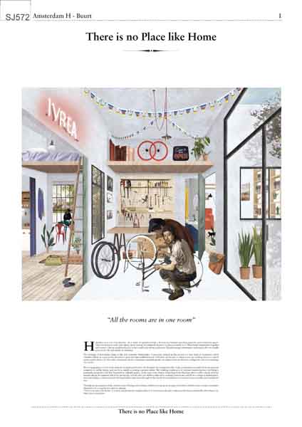
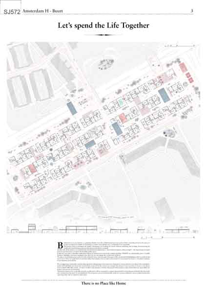
Habitation is an act of production. As a result of capitalist trends a division has formed separating domestic and production spaces. What binds communities together and creates a vibrant neighbourhood is in fact small scale urban production. We are suggesting a revival of the domestic workshop tailored to the demands of contemporary life. A necessary element in this process is a new form of coexistence which considers labour as a part of life, therefore a space becomes multifunctional.


THERE IS NO PLACE LIKE HOME is a lively and productive neighbourhood. If our home is the place where we feel most comfortable, then there is no better place to produce. The working condition is in constant transformation, everything is potentially productive and at the same time, despite technological development, there is still a strong need for manual labour.

Bijlmermeer is an area known as a planning blunder from the CIAM-inspired post war period. Before attracting investors the purpose is to propose an approach capable of visualising a scenario of possibilities for a community to be sustainable.
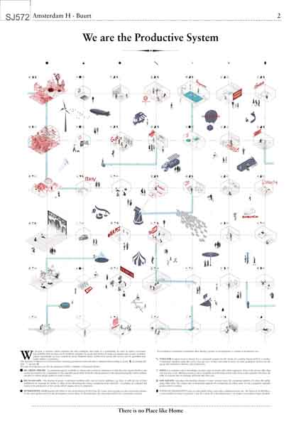
In order to achieve economic sustainability what we have can be traded in exchange for goods and services forming a productive peer to peer economic system. Accordingly we have created an initial blueprint based on several parameters including production time and what is obtained from trading it as money, knowledge, goods and services. The aim is to investigate the spatial consequences of breaking the barrier between inhabiting and working, deconstructing the traditional formal housing unit and unlocking its productive potential.

We are suggesting a system offering spaces that can be more domestic or more productive. Each individual can choose how involved they want to be in this system, being part of it is a free choice. Another point of the project is to transform the monofunctional district into a “land without shadows, always in light” – the introduction of mixed activities and functions to promote the livability of public space. In this way we introduce small interventions in selected areas next to the existing dwellings. INNESTI are tools that affect the city and trigger the revitalization within it. This project wants to be a replicable research able to rejuvenate a context characterized by monofunctional blocks. The proposal is not an insurmountable wall, but a porous settlement, not an isolated element but a growing entity able to expand to other areas.

Jury comments


Interesting concept of habitation as act of production and an attempt for a revival of the domestic workshop with a research on typologies for a productive system based on a circular economy. The aim of the project is to create a community through fostering productivity. The jury is critical about the low density with only two floors of program, a large amount of public space and buildings that lack clarity of orientation and access. The jury felt that is a rather generic urban pattern and lacks explicit relationships to its context.

Bjarne MASTENBROEK

Ellen HELLSTEN

Jürg DEGEN

Mark RABBIE

Marlies ROHMER

Mattijs VAN RUIJVEN

Olivier MEHEUX

Ruurd GIETEMA

Tania CONCKO

Project Team

Ylenia Rose Testore (IT), Architect
Michela Di Saverio (IT), Architect

Valeria Colosetti (IT), Architect

Contact information

yrose.testore@gmail.com

Via Messina 15, 20154, Milano, IT

Made in Bijlmer

SHORT LISTED

AUTHORS / COLLABORATORS

Morten Vestberg Hansen (DK), Architect
Christopher Galliano (DK), Architect

Rasmus Wieleman (DK), Architect

Project Description


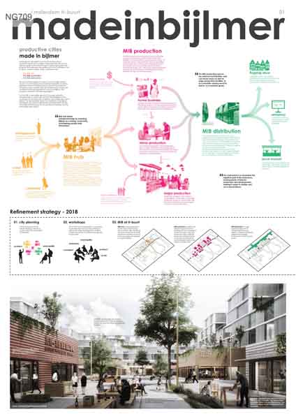
We propose to develop H-buurt by introducing a mix of production space and housing on the project site. We want to raise the quality of the area through a well-thought productive program, that empowers the residents of H-buurt and Bijlmer. The program “made in bijlmer” (MIB), is split three ways; The MIB hub, the MIB production and the MIB distribution.

The MIB hub is a catalyst for business start-ups. The hub is serviced by the municipality in cooperation with locals, providing help and knowledge for people wanting to start a business within the MIB structure. Furthermore, the MIB hub contains basic meeting rooms, workshop spaces and production facilities, available for small businesses, that have not yet access to such functions.
The hub doubles as a community house, hosting larger events rooted in H-Buurt and Bijlmer.

The MIB production spaces are extrovert and flexible, and can house minor as well as major production facilities, to accommodate varying need for space, as a business grows. New production spaces are added to the project site, and the surrounding ground floors are transformed into production space to further activate the project site. Lastly every existing apartment is perceived as potential production space, as every resident can start up a home business.

The MIB distribution is a logistical structure supporting every business enrolled in the MIB. The structure consists of storage, transportation and sales. The main point is to streamline the logistical part of the businesses, leaving plenty of time for production and development, making it easier to startup and run a new business.

The point of the program is to make it easy for single residents as well as local corporations and existing companies to start up business in H-buurt. Branding H-buurt as a start-up community, will inspire a sense of pride within the residents and continuously contribute to the development of H- Buurt and Bijlmer.

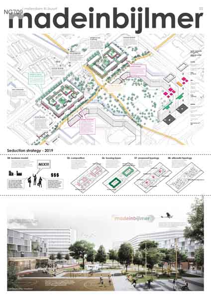
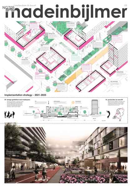
To fund MIB, a reasonable amount of housing is added to the project site. In conjunction with the MIB buildings the new housing enhances the quality of existing, and creates new, urban spaces. The new buildings respect the aesthetics of the Bijlmer masterplan, and adds contemporary social elements that raise the quality of the housing, the new production facilities, and the surrounding urban space.

Jury comments


housing as the moneymaking agent for economic development. The project proposes two blocks of stacked program, with residential accommodation located on the upper levels. The typology is conventional, clear and realistic.

Bjarne MASTENBROEK

Ellen HELLSTEN

Jürg DEGEN

Mark RABBIE

Marlies ROHMER

Mattijs VAN RUIJVEN

Olivier MEHEUX

Ruurd GIETEMA

Tania CONCKO

Project Team

Morten Vestberg Hansen (DK), Architect
Christopher Galliano (DK), Architect

Rasmus Wieleman (DK), Architect

Contact information

mh@folkarkitekter.dk

Ryesgade 19a, 3.sal 2200, Copenhagen, DK

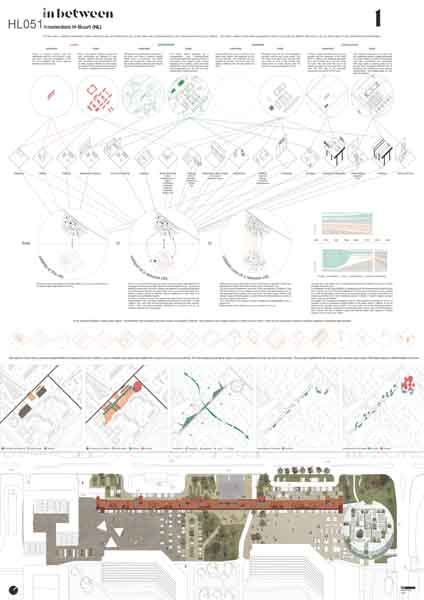
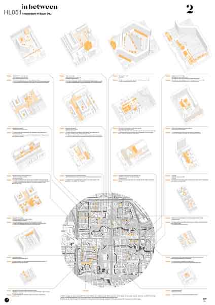
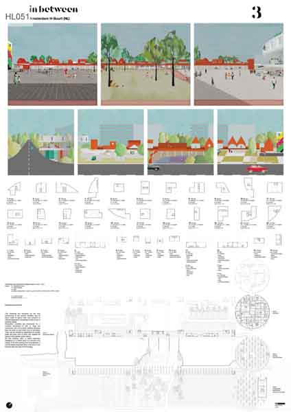
In Between

SHORT LISTED

AUTHORS / COLLABORATORS

Alessandro Perotta (IT), Architect
Valeria Iberto (IT), Architect

Filippo Vaijra (IT), Student in Architecture
Giovanni Ratto (IT), Student in Architecture
Alessandro Chilosi (IT), Student in Architecture

Project Description


In The Little Street (J. Vermeer, 1658) some details insist on the ambiguity between the outer space of the city and the interior space of the dwellings. A door, cut out in the wall joining the two brick facades, leads to a courtyard whose soil has the same colour of the road one. This speaks about continuity: the road and the living space are linked together. Furthermore, some benches, on the edge of the road, emphasize the relationship between domestic and public spheres. The space between buildings is one of the dominant subject of the painting, a seemingly indistinct void overlooks the uses and suggests a potential versatility: the sidewalk is the place for moving, for resting and, why not, for playing.

In the modernist Bijlmer the void was designed as a pervasive park-land crossed by the infrastructure and surmounted by the residential blocks. Each part - park, infrastructure and residence - was conceived exclusively. The urban renovation has approached the problems of Bijlmer by a systematic reduction of these individual elements and today living conditions have been improved. However, the modernistic idea of public space has been atomized, now it has become a generic space between buildings often underused, sometime abandoned.
Overall there was quite completely overlooked an important work for the cohesion between urban pieces. Now that the “elements” have been fixed, it is time to think about the “space in-between”!
Bijlmer’s unsafe parking garages, such as the one in the project area, have been demolished and substituted with extended open-air parking. This is a large amount of passive surface.

Nowadays free car cities, sustainable mobility and the idea of “no-mobility” (many activities can be done everywhere) are real. Our proposal doesn’t imagine that the car will disappear from the city but, according to the progressive decrease of the car need, we think it is possible to plan a systematic implementation of the Bijlmer’s public space connected to the idea that the parking can play a real role in public space design. Parking can be just one of the several tools that contribute to the design of a public space free from the need of a specific functionality and a space strong enough to absorb during the time the changing of its elements. Without this kind of space the city cannot be productive because as in Veermer’s painting this space simply generates opportunities.
H-Buurt has the chance to start his way to be productive.

Jury comments


This plan makes an interesting relation to the wider context by introducing an urban strip of specific public spaces that enhances the potential of the area to be productive. The scheme for the H-Buurt is rather schematic and is not very clear in spatial terms and lacks a specific development strategy. The jury thinks that this is a rather conservative plan which does not conform with the current world.

Bjarne MASTENBROEK

Ellen HELLSTEN

Jürg DEGEN

Mark RABBIE

Marlies ROHMER

Mattijs VAN RUIJVEN

Olivier MEHEUX

Ruurd GIETEMA

Tania CONCKO

Project Team

Alessandro Perotta (IT), Architect
Valeria Iberto (IT), Architect

Filippo Vaijra (IT), Student in Architecture
Giovanni Ratto (IT), Student in Architecture
Alessandro Chilosi (IT), Student in Architecture

Contact information

perottaibertoarchitetti@gmail.com

Piazza Grillo Cattaneo 2r, 16123, Genova, IT

Piarcoplein

Read more about the site brief

Scale: Large – Urban and architectural

Team representative: Architect, Urban Planner or Landscape Architect

Site family:

Location: Piarcoplein, Amsterdam

Population: Amsterdam: 835.000

Study area: 10,2 Ha

Project site: 1.86 Ha

Site provided by: City of Amsterdam

Actor(s) involved: City of Amsterdam

Owner(s) of the site: City of Amsterdam

Prizes: 1st Prize €12,000, Runner-up €6,000, Special mentions

SITE DEFINITION

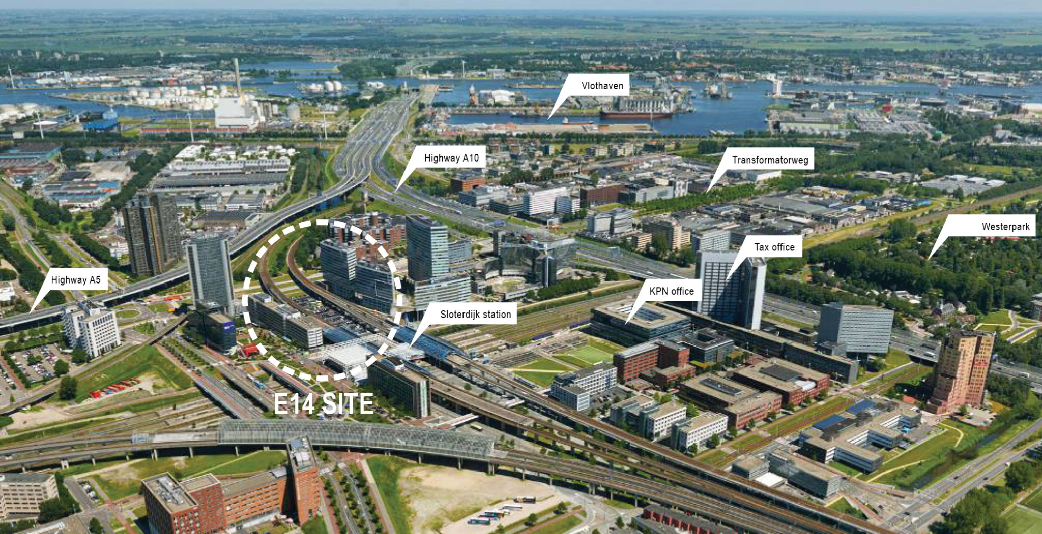
Piarcoplein is currently a ‘park and ride’ area; it’s a place where cars are parked for long periods. For people who live in this region of Amsterdam, this is a convenient place to park their car and then travel by public transport either to the airport or to the city centre. Piarcoplein is the least attractive place in Sloterdijk Centrum. The site is both framed and trapped by streets, privatized open spaces and elevated train and metro tracks. The area currently lacks liveliness. The combination of cars on the ground and the bundles of roads, and regional and local transport infrastructure make the area feel like a non-place. And due to the lack of social control there is regular (minor) crime e.g. car burglary.

WHAT IS CITY STRATEGY FOR THE AREA?

The long-term strategy is to transform Sloterdijk Centrum from a monofunctional business area into a vibrant, mixed-use urban quarter. Recently, redundant offices have been converted to hotels, student housing, short stay accommodation, retail and other amenities. These changes have been guided by some of the most flexible zoning policies in the Netherlands. Sloterdijk Centrum’s location mid-way between Schiphol international airport and the city centre helps to ensure that it will continue to be a dynamic area. There is no clear final image in sight but the large amount of infrastructure will remain a given.

MAIN QUESTIONS AND COMPETITION ASSIGNMENT

  1. First and foremost, there is a requirement to put the Piarcoplein on the map by proposing an original, inspirational idea. Quality and sustainability, mobility, and production are key words that are of importance to the municipality. There is considerable space for a design proposals within the strict delineations of the project site. Proposals can range from public space design, temporary additions, small scale buildings or other options. Is it imaginable to consider building? And if so, should these buildings be higher than the elevated train tracks? In the long term, what are the chances for proposing larger building volumes within the project site? Ideas are expected to enhance productivity or to show-case the productive qualities of the surroundings.
  2. The assignment asks for scenarios regarding car mobility at this location, in relation to the region and Amsterdam. The expectation is that the role of the car will change in time. In the city, the possession of cars is already significantly decreasing. The question is whether this will also apply to areas in the greater Amsterdam region, from which residents use Sloterdijk Station as a hub to transfer to public transportation. It’s also important to consider the way in which future car parking is given form on Piarcoplein. The stacking of parking spaces, for example, is an option. Design solutions are expected that address the evolution of mobility and parking. The current number of P+R parking spaces is 196.
  3. On the project site it is important to consider the connections and public routes that pass through and around the site to and from Sloterdijk Station. At the street level, the human scale must be reintroduced. It is a matter in which the “city at eye-level” takes central stage. The expected increased usage of the infrastructure surrounding the station can both be an obstacle and an opportunity. At street level, provisions must be made for adequate drop-off areas for cars and touring buses. The following types of visitors must also be considered: pedestrians, many, many, cyclists, scooters, tourists, cars, touring cars/buses, disabled persons, elderly, children, and so on.
  4. At the scale of the study area, the task is to consider How can these groups be received in a more welcome and friendly atmosphere. An innovative vision for the soft programming of the open areas is expected. Proposals are expected to create meaningful connections between the three main squares around the station ( Piarcoplein, Orlyplein and Carrascoplein) to improve the user experience for visitors and residents. In the area surrounding Sloterdijk Station, the focus, concerning the public space, has, until now, primarily and successfully, been on temporariness. The question is whether that approach should be continued, or whether other solutions, that incorporate more permanent features such as water and greenery could be considered.

SITE IMAGES
WINNER

Undergrowth

WINNER

AUTHORS / COLLABORATORS

Federica Andreoni (IT), Architect
Anna Chiara Bonora (IT), Architect
Valeria Lollobattista (IT), Architect
Mattia Biagi (IT), Architect
Marco Mondello (IT), Architect
Valerio Socciarelli (IT), Architect

Project Description


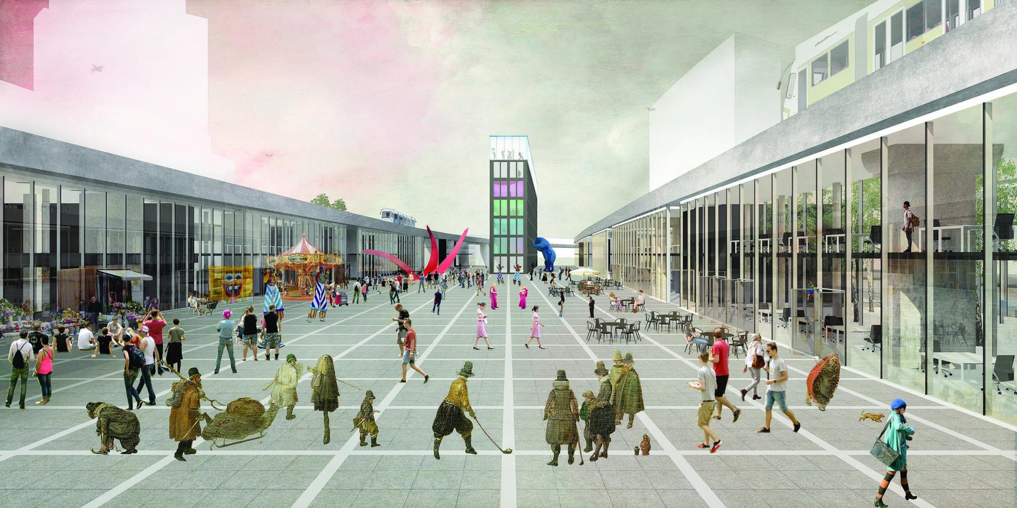
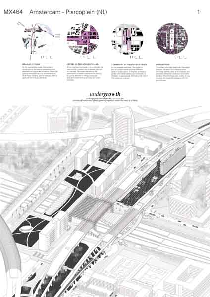
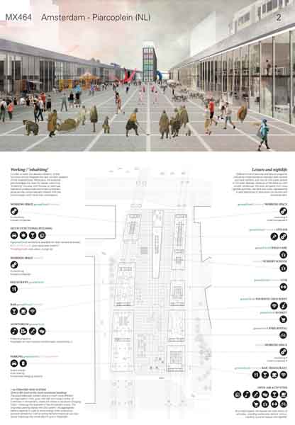
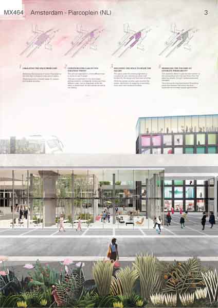
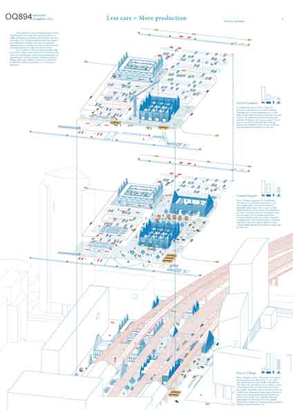
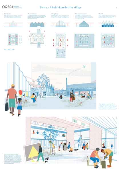
Undergrowth consists of bushes and plants growing together under the trees in a forest.

We should deal with the undergrowth of Sloterdijk area. No transformations in the sense of a new, more vibrant and diversified urbanity will be possible while this part of the city remains composed of mere high, mono-functional and isolated buildings. We need to take care of and give form to this empty and generic space around them; we need to work on definition and proportions of open spaces. The renovation of Piarcoplein is an opportunity to welcome this attitude and take a step towards a wider transformation.

Within an area that already has plenty of parks and other vaguer open spaces, it is strategic to typologically think about the future Piarcoplein as a square. This way, it will be able to better receive all the systems that arrive there, both ecological and transport, and to foster vibration, affluence and proximity in the neighborhood. A square is, above all, a precise answer to the demands inherent in the theme of rethinking the productive city. Historically, it is a hybrid space that offers itself as support for different aspects of city life. Since a square is naturally characterized by compresence and proximity of activities, it can interpret and give space to a new idea of production, more circular and diffused.

Without any nostalgic attitude, we learn from historical cities that lively squares need to be mainly mineral, enclosed and precisely defined by continuous and active borders. For this reason, erecting new volumes is a necessary operation in Piarcoplein. Proportions of the buildings are also crucial for the scale of the square, since the dimensions of the existing constructions are too aloof to dialogue with the groundscape.

Considering these premises, the proposal consists in a series of operations:
-Liberating the space from cars to imagine a new kind of space for various and variable activities
-Concentrating cars in two strategic points to organize them in a much more efficient way in terms of use of space
-Occupying the space under the high-lines with new volumes to enclose the space and shape the square through solid and active borders
-Modelling the volumes to generate visual and physical permeability, and then intercept flows from the surroundings streets
-Proposing new activities to increase mixité and vibration within the area
-Using open spaces and vegetation to diversify and enrich the inner landscape under the high-line

Jury comments


This proposal comes up with a simple solution for a complex situation through creating a public square with clearly defined boundaries under the existing infrastructure structure. The scheme creates a well-dimensioned square with buildings under the tracks without disturbing the flow of the different users. This set-up follows the logic of traditional arches underneath train tracks creating special spaces that offer interesting locations for additional urban programs in a friendly and transparent way. The scheme is smart in the way that it is organising the program at the ground level. The square is a simple gesture offering rest and quietness for this area without direct focus on connection, and by doing so, offers a clear vision and an opposing view to the current messy situation. This openness allows the connection with the station to happen naturally. The jury values this proposal as a solution for the immediate future without blocking a long-term development strategy. There some were discussions in the jury about the transparent building on the reservation for parking and the way future flows of residents are integrated in the plan.

Bjarne MASTENBROEK

Ellen HELLSTEN

Jürg DEGEN

Mark RABBIE

Marlies ROHMER

Mattijs VAN RUIJVEN

Olivier MEHEUX

Ruurd GIETEMA

Tania CONCKO

Project Team

Federica Andreoni (IT), Architect
Anna Chiara Bonora (IT), Architect
Valeria Lollobattista (IT), Architect
Mattia Biagi (IT), Architect
Marco Mondello (IT), Architect
Valerio Socciarelli (IT), Architect

Contact information

federicandreoni@gmail.com

Via Efeso 23, 146, Roma, IT

RUNNER-UP

Urban Platform. Digital Work and Placemaking for Piarcoplein

RUNNER-UP

AUTHORS / COLLABORATORS

Michele Angelo Vallicelli (IT), Architect
Giulia Panadisi (IT), Architect
Annalisa Pilati (IT), Architect

Project Description


This proposal aims to investigate how digital and physical connectivity can recombine an existing transit oriented development into an urban platform. Considering work activities as a core productive factor for cities, workplace digitalization has in fact implications not only for the architectural scale, but for the overall urban space. Firms - previously identifying themselves into office buildings - are turning into platforms - that means the overall complexity of urban environment becomes their main productive resource.

Within this framework, we proposed the design for a digital and physical infrastructure that allows local collaboration in space and provides a virtual environment of local connectivity which doesn’t have access to the internet but works as a City Operating System.

If planned with an open source approach we believed this is a promising way to design an attractive environment for those digital industries or researchers interested in using urban data to experiment their services, producing innovation and sustaining, in its economy, the urban development phases. A sensing system, for instance, can allow to combine data on rail public transit with cars fluxes or parkings. Moreover, local environmental data can be matched with Orlyplein gardens uses for irrigation or botanic research. If this concept is extensively known and experimented from an engineering perspective, we wanted to explore its possible implications for urban design.

Piarcoplein is an already dense and high rise area, with an high transit accessibility. The key strategy of our proposal is to oppose to existing vertical developments an horizontal ring of pedestrian connectivity which puts in continuity, at level +7.00 m, Piarcoplein, Carrascoplein and Orlyplein, today divided by vehicle streets and vertical gaps. This system can be extended linearly in four temporal phases through Piarcoplein, connecting neighborhood with an increasingly mobile workforce which, might give this area the potential to be re-vitalized. Existing parkings are moved two levels underground turning Piarcoplein into a whole pedestrian area at ground level. Instead of new buildings, it is provided a system of adaptive and modular structures which completes the spaces under the raised railways. This can support the temporary location of small industries or researchers using the digital infrastructure to conduct experiments in place and for the place, potentially collaborating and exchanging knowledge.

Jury comments


This project creates a very interesting connection between the station and its surrounding by linking the different squares. The design brings together the different movements and flows in the area. By introducing a new mid-level movement system, the project creates a landscape underneath the elevated train tracks of folded footpaths and pavilions with urban program and places to stay. Using the different movements and flux as well as integrating ‘the bypass’ and the parking makes this a proposal worth looking at it seriously. The idea of respecting the existing structure and building underneath the tracks is strong but these new landscapes generate much more space that would need to be animated and programmed.

Bjarne MASTENBROEK

Ellen HELLSTEN

Jürg DEGEN

Mark RABBIE

Marlies ROHMER

Mattijs VAN RUIJVEN

Olivier MEHEUX

Ruurd GIETEMA

Tania CONCKO

Project Team

Michele Angelo Vallicelli (IT), Architect
Giulia Panadisi (IT), Architect
Annalisa Pilati (IT), Architect

Contact information

michelangelo_v@yahoo.it

Via Cassia 901/a, 189, Rome, IT

SHORT LISTED

Tropical Garden

SHORT LISTED

AUTHORS / COLLABORATORS

Irene Iglesias Román (ES), Architect
Jacobo Márquez Muela (ES), Architect

Project Description


The goal of the project is to create a living and working place inside one of the main metropolitan transport hubs in Amsterdam city. In response to this starting point, the proposal radically makes an opposite urbanism to that of the current neighbourhood: a human scale place in which a dense wild tropical garden with foreign species grows and hidden buildings which seem to be chaotically organized show up along the path, everything covered by a glass vault that creates a warm atmosphere protected from rain and city noises. This contrast is perceived both in urban and building interior spaces: the garden literally enters inside them, as if they were forgotten ruins.

Everything is set up in order to carry the user physically and mentally far away from the surrounding city, helping them to both rest or concentrate depending on their mood.

Jury comments


The idea of a tropical garden is a nice image that gives a completely different look at the place. Through this intervention the whole situation is put in a new context in order to create a lively place with a big staircase towards the station hall. This landscape approach with pavilions has a lot of flexibility for the development. The orientation of the public space in relation to the flows of users and the infrastructure is problematic and there are no clear front and backsides.

Bjarne MASTENBROEK

Ellen HELLSTEN

Jürg DEGEN

Mark RABBIE

Marlies ROHMER

Mattijs VAN RUIJVEN

Olivier MEHEUX

Ruurd GIETEMA

Tania CONCKO

Project Team

Irene Iglesias Román (ES), Architect
Jacobo Márquez Muela (ES), Architect

Contact information

irene.iglesias.roman@gmail.com

C/ Amapola 12, 28939, Arroyomolinos, ES

Rooted Landscape

SHORT LISTED

AUTHORS / COLLABORATORS

Jose Luis Munoz (ES), Architect
Román Cordero Tovar (MX), Architect

Daniel Usero Guerrero (ES), Architect
Cristina Medina Valverde (ES), Student in Architecture
Lorenzo Vallone (IT), Student in Architecture
Agnieszka Kepa (PL), Student in Architecture
Yoshimi Horiuchi Gallardo (MX), Student in Architecture

Project Description


“Rooted Landscape” deals with and contributes to the topic of residual infrastructural spaces as an opportunity for life and enjoyment of the city for the sake of a higher urban productivity. Through a detailed and precious treatment of the spaces between the Piarcoplein infrastructures, our project aims to offer a new perception of habitability for this non-place. Architecture and public space fuse together to create a new rooted landscape over the existing one.The new Piarcoplein square is an elevated garden covered by four concrete viaducts. The atmosphere is strongly marked by the combination of natural elements supported by artificial devices. The new system includes both floor-standing elements (water ponds, garden and building foundation), and suspended elements that hang from the existing viaducts. So the new public space appears as if it is floating in the air between the viaducts and carpark. The matrix structure of the whole complex is the result of a geometric pattern which allows the position of pillars and slabs in points not affecting the optimal functioning of the car park. This structure is gradually transformed to integrate the position of the existing and future viaduct pillars, without losing unity and geometric consistency. The result is a diverse landscape that integrates paths, uses and sensations around a common geometric pattern.Even though the place is dominated by public spaces for resting and walking, a series of nine types of small pavilions set up to be used in free and diverse ways will emerge alongside the elevated paths, small squares and vegetation and water ponds.The idea is to provide the system with small scale inner spaces, lightweight and simple in terms of construction but with great architectural appeal. Thus, these emerge to encroach the existing structures, but also generate visual kindness and smooth the rigidity of strictly technological elements. They are suspended in an isotropic and balanced way within the new Piarcoplein garden. They are conceived as high quality spaces, available to future users and entrepreneurs from the area.The new uses should interact with the environment in order to enrich the experience and promote the respectful uses of the space: Exhibiting art, producing art, relaxing, eating out, taking care of children, purchasing food and drinks, massage, smoking, indoor sports… All these activities they give the place a new identity and promote new economic opportunities.

Jury comments


This proposal is creating a three-dimensional landscape by introducing an artificial structure and additional level of public space. Landscape elements, bridges and voids are used to create a world on its own and at the same time offers a solution for a better atmosphere for the parking spaces on the ground floor. The jury is critical about introducing another public level which creates even more public space and the adding of new tracks which is not temporary at all.

Bjarne MASTENBROEK

Ellen HELLSTEN

Jürg DEGEN

Mark RABBIE

Marlies ROHMER

Mattijs VAN RUIJVEN

Olivier MEHEUX

Ruurd GIETEMA

Tania CONCKO

Project Team

Jose Luis Munoz (ES), Architect
Román Cordero Tovar (MX), Architect

Daniel Usero Guerrero (ES), Architect
Cristina Medina Valverde (ES), Student in Architecture
Lorenzo Vallone (IT), Student in Architecture
Agnieszka Kepa (PL), Student in Architecture
Yoshimi Horiuchi Gallardo (MX), Student in Architecture

Contact information

jlm.estudio@gmail.com

Calle Trabuco 3, 18001, Granada, ES

Piarco Village

SHORT LISTED

AUTHORS / COLLABORATORS

Tomaso Boano (GB), Architect
Valentine Gruwez (BE), Engineer-Architect
Lieve Smout (BE), Urban Planner

Project Description


Like many European cities, Amsterdam started out as a village in support of a local economy whereby the city became a productive world capable of sustaining itself. The construction of the Noordzee Kanaal in 1876 saw the harbour moving westwards - gradually decreasing its level of production and becoming more just a vessel for goods. Globalisation - encouraged by the introduction of Schiphol Airport after WW1 - encouraged the city of Amsterdam to reinvent itself as a creative knowledge economy. Today, city, harbour and airport make up Amsterdam’s economic landscape, but their geographical divorce prevents interaction, and this comes at a price - an average dinner for example has travelled 30,000 kilometres.

Amsterdam now functions as a three-poled non-productive city. So how do we turn the tide? By exploiting the incredible potential of Amsterdam’s rail and road infrastructure. This existing network presents itself as the ideal carrier for re-connecting city, harbour and airport. A network of productive villages will result in a polycentric productive city capable of re-introducing Amsterdam’s circular economy. With a daily passenger rate of 50,000 people, Piarcoplein forms the ideal test ground for the first productive village.

Today, the square consists of a landscape of infrastructures; a series of beautiful columns and bridges. Celebrating these two key elements as catalysts for spatial layout, Piarco’s productive village weaves around and between columns and bridges, breaking up the site’s vastness and introducing a sequence of human scale landscapes. The principle of induced demand proves that the provision of car parking simply generates car traffic. Reducing car parking will therefore decrease car traffic. In each phase of Piarco’s transformation, the productive village works differently according to the extent of parking space. Exploiting the limitation of opportunities to build between existing and future bridges allows the village to peek up to train level to announce itself and catch the eye of numerous bypassers.

Hybrid typologies - a symbiosis of the civic world and the productive world as we know it - will populate Piarco Village. These typologies provide spaces in a variety of shapes and scales, a permanent base capable of adapting to an extremely flexible productive programme. A new strong visual identity and a highly productive programme counterweight Piarco’s surrounding blandness with a joy for life that was previously unimaginable.

Jury comments


his plan is adding production space on the ground level where various types of production could take place. By placing new buildings in the middle of the parking area the project will transform the character of the place from mobility to productivity. The jury is rather critical about the historical building references and the orientation of the in-between spaces which look a bit naïve and romantic.

Bjarne MASTENBROEK

Ellen HELLSTEN

Jürg DEGEN

Mark RABBIE

Marlies ROHMER

Mattijs VAN RUIJVEN

Olivier MEHEUX

Ruurd GIETEMA

Tania CONCKO

Project Team

Tomaso Boano (GB), Architect
Valentine Gruwez (BE), Engineer-Architect
Lieve Smout (BE), Urban Planner

Contact information

info@tomasoboano.com

28, N80 AB, London, GB

Productive People - Happy People

SHORT LISTED

AUTHORS / COLLABORATORS

Rafail Gkaidatzis (GR), Architect
Jonian Silaj (AL), Architect Urbanist

Project Description


Modern ways of living, innovative materials, the millennials generation, new industrial sectors, contemporary productive and sharing spaces, new means of transportation and communication and the new “standards” in human relations and societal values, are gradually but strongly generating new urban images. Focusing on the train station, as the primal factor and generator of the urban environments in the area, our strategy develops between the three existing urban squares. The pedestrian and cycling flows and functions meet the transition that happens firstly through the station and secondly through elements of space that need to be adjusted and integrated in the urban fabric. The new developments in the area and the future goals, impose a new character that creates a fertile ground for urbanity and form the base for a long-term vitality. The strategic long-term design, regarding the new connections, negotiate between those elements that can be fixed and integrated (pedestrian bridge) and those elements that need to stay flexible to anticipate future changes (new station, new tracks etc.) Therefore, a new identity is established, based on the extension of the surroundings and street networks but also reinforced with new programmatic clusters, green and new visual connections. The transformation of the current programmatic needs (new housing, casino, Media College etc.) and socio-economic circumstances are also taken into consideration in pursuance of a flexible public space. There are no unattractive entrances in the area or undefined urban edges. New infrastructure focuses in connectivity while avoiding fragmentation of the existing and future urban fabric. At the same time, shifting from heavy infrastructure to “heavy” nature, the new green is not isolated but knitted with the existing and the future program. Redesigning democracy means in practice that our common city spaces, are the right place for a collaborative production of public life, goods and services. The flexibility in “including” is a key aspect for the long term prosperous continuity of an urban environment.

Jury comments


This proposal was selected for the Europan Cities and Jury Forum, held in Helsinki in October 2017. It lacks the concreteness of a proposal but it can be considered as being honorable because it is a new idea.

Bjarne MASTENBROEK

Ellen HELLSTEN

Jürg DEGEN

Mark RABBIE

Marlies ROHMER

Mattijs VAN RUIJVEN

Olivier MEHEUX

Ruurd GIETEMA

Tania CONCKO

Project Team

Rafail Gkaidatzis (GR), Architect
Jonian Silaj (AL), Architect Urbanist

Contact information

r.gkaidatzis@outlook.com

Westplantsoen 16A, 2613 GL, Delft, NL

Sluisbuurt

Read more about the site brief

Scale: L – Urban and architectural

Team representative: Architect, Urban Planner

Site family:

Location: Sluisbuurt, Amsterdam

Population: Amsterdam: 835.000

Study area: 48,3 Ha

Project site: 2,29 Ha

Site provided by: city of Amsterdam

Actor(s) involved: city of Amsterdam

Owner(s) of the site: city of Amsterdam

Prizes: 1st Prize €12,000, Runner-up €6,000, Special mentions

SITE DEFINITION

Surrounded by water on two sides, Sluisbuurt is today a tabularasa. The city’s intention was to build on this location much earlier but those plans were delayed by the economic crisis. This year the city has completed a concept urban plan, which will be basis for the future development. In recent times, Zeeburgereiland’s connectivity has been improved. Access to IJburg by car, bicycle and public transport is now possible. Zeeburgereiland is directly connected to Amsterdam’s main ring road; two busy roads with bike paths intersect the middle of the island; on the southern edge of the site a tram station is the main public transport link between the city center and IJburg.

WHAT IS CITY STRATEGY FOR THE AREA?

Over the last 20 years, intense housing production has taken place in Amsterdam-Oost as old districts and former dockland areas were upgraded and regenerated. The site for the competition is located on Zeeburgereiland and in the future it will link the centuries- old Indische Buurt with the new residential districts in IJburg and Amsterdam’s eastern docklands. Today, Amsterdam is under pressure to expand because it is recognised as an attractive international city. It is trying to find its own way to navigate these market forces. Sluisbuurt has been conceived as a compact city extension and while tall buildings characterize the vision, at street level the neighbourhood should feel typically Amsterdam.

MAIN QUESTIONS AND COMPETITION ASSIGNMENT

  1. On the project site, an architectural vision is expected for a contemporary combination of living and working at the scale of the block, street and neighbourhood to create a mixed-use residential area. Design ideas should not be limited to only the public space and special features in the plinths of buildings. The municipality is looking specifically for forms of mixed-use throughout the building. How can living and working be combined in vertical urban form? The search is for a vision of multifunctional buildings at each scale in this new neighbourhood.
  2. The study area corresponds to phase one of the Sluisbuurt concept urban plan. At this scale, the task is to consider how urban, architectural, spatial, functional and landscape qualities can be established in the early years of the project. The creation of a neighbourhood of such large dimensions demands, in the first phase, an attractive feel and appearance for future residents and workers. How to create the first attractive steps in a resilient mixed-use residential area? How can this be achieved, and by what means?
  3. Based on a tangible design for plots 6b and 6c, participants are requested to prepare urban design guidelines for buildings, public space and the transition between the two. These guidelines should help achieve the general goal to create a dynamic, viable and inclusive Amsterdam neighbourhood.

SITE IMAGES
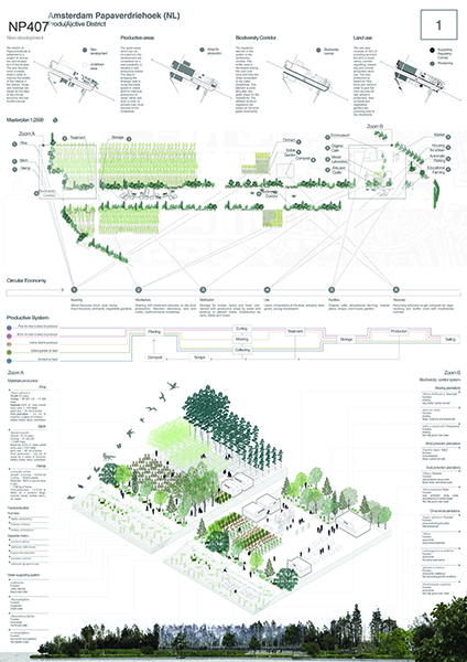
WINNER

Top Spin

WINNER

AUTHORS / COLLABORATORS

Miguel Huelga de la Fuenta (ES), Architect
Iria de la Pena (ES), Architect

Project Description


The proposal suggests an evolution towards a more flexible and sustainable urban model, able to respond not only to the current living and working needs but also adaptable to future changes and trends. Is difficult to predict the way work, housing and productivity will continue to develop in the coming years and which spatial requirements will fit with that development. Thus, the proposal is to create a flexible model designed to host both residential and non-residential functions, foreseeing future needs.

The traditional construction system is based on rigid elements, with a long life-span but limited flexibility program-wise. This model is transformed to split the rigid and durable elements on the one side: ‘SUPERSTRUCTURE’, and on the other side those linked to the final use of the space, more flexible and with a shorter life: ‘GUEST CONSTRUCTION’. Setting a time-frame division, with different cycles of use over time, the building adapts the program to the population requirements.

Unlike the typical high-rise development, with towers resting in a plinth, the proposal here is to emphasize their presence. The footprint of the towers is clearly defined at street level and works as a Hub. Main facilities in the block are placed in the lower levels and the public space is organised around them sorting out the risk of privatisation of the public space due to logistics or public-safety. The activity, typically facing main streets, is now transferred to the courtyards surrounding the towers.

‘Guest constructions’ are designed in response to the current needs and Master plan vision, establishing the first steps to create a vibrant neighbourhood, attractive for future residents and workers. Special attention is paid to the lower floors, essential to create an active neighbourhood. At grade level, the plinth program is limited to small mixed-use units, a combination of living-working and small productive or commercial activities, linked to the street. The integration of workspace and small productive activities in residential district generates a lively atmosphere and, with that, contributes to the attractiveness of a neighbourhood.

The internal distribution of living and working typologies is defined and limited by the superstructure, supply connection points and facade alignments but without a closed layout. Internal partitions and room configuration will come with the final user. A more flexible design with less specialised spaces is encouraged.

Jury comments


This plan is convincing as it delivers the best organization of the ground floor. The design and organization of the lower levels of the tapered towers bring quality and spatial and functional diversity to the public space. The design enhances porosity and interaction between the plinth and the towers, where the core program is organized. The massing of the high-rise elements and the distribution of different typologies within these elements respond well to the surroundings.

The design approach demonstrated in the project could be establish urban design guidelines. The façade design offers a lot of flexibility and creates nice possibilities for gardens to be positioned behind the facades. It’s a clever building scheme with double height units where all kind of uses could be possible. A phased development is easily possible.

The jury is convinced by the strong public space ideas and because the proposal responds well to the brief. There is some discussion on the singular identity of the over-arching superstructure which is a strength but also a potential weakness if applied to the whole site.

Bjarne MASTENBROEK

Ellen HELLSTEN

Jürg DEGEN

Mark RABBIE

Marlies ROHMER

Mattijs VAN RUIJVEN

Olivier MEHEUX

Ruurd GIETEMA

Tania CONCKO

Project Team

Miguel Huelga de la Fuenta (ES), Architect
Iria de la Pena (ES), Architect

Contact information

info@sukunfuku.com

Calle de Santa Doradia 5 IZDA,  33202, Gijon, ES
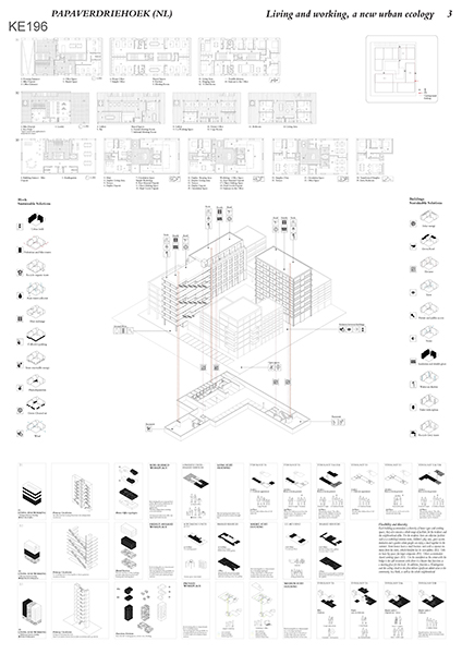
RUNNER-UP

Bouwen in Amsterdam

RUNNER-UP

AUTHORS / COLLABORATORS
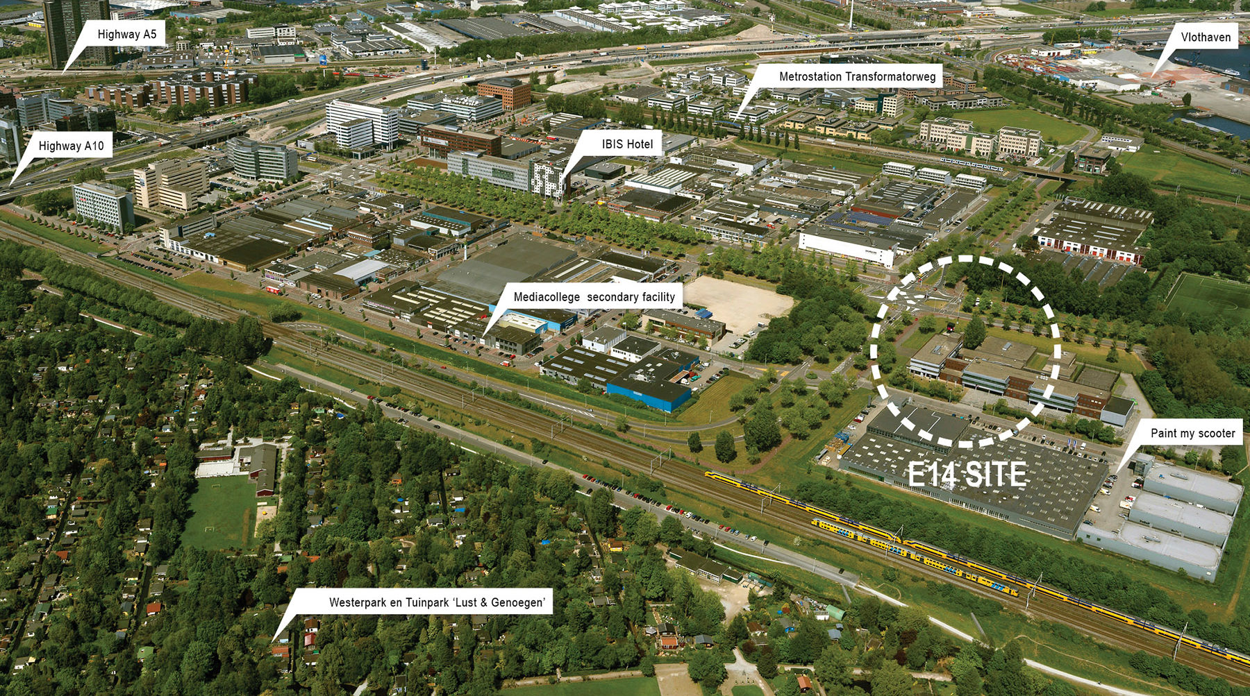
Reinier Suurenbroek (NL), Architect
Barthold Meijer Timmerman Thijssen (NL), Architect

Project Description


Bouwen in Amsterdam
We miss generous spaces in modern architecture; there is too much focus on efficiency. Quality cannot be expressed in gross/net floor areas, how spaces are proportioned is much more important.
Our competition entry is an investigation in how to build a new piece of city where the streets and the buildings can really come alive as they change over time. Rather than building on an image we propose to focus on generous, well-proportioned indoor and outdoor spaces that allow for changes in use and shifts in the degree to which they are either public or private.
In our proposal we literally sample the proportions of the Amsterdam canal houses. We sample the deep plan, the section with the variation in floor heights, the patterns of window openings, the light wells and the way the buildings meet the street. To meet today’s quality standards and to make everything extra flexible we propose to use a modern post and beam structure on an 8.1 x 8.1 meter grid.
Canal houses have interior spaces that vary in width, depth and height and this giving them a timeless quality beyond their function. The vertical windows help in defining the character and experience of the canal house. With modern building methods we can recreate these qualities but it doesn’t make sense to replicate all the classical details that were made in a time when everything was handmade. Therefore we propose to sample only those aspects of the canal houses that make sense in our time and use them as a the brief for a modern architecture.
By placing a large portion of the volume in slender towers we keep the public realm spacious with street profiles that are not too narrow and dark. The lower 3 to 5 floors maintain a close relationship to the street and to the private gardens in the courtyard and on the roofscape. The towers all have beautiful views overlooking the green roofs and towards the city of Amsterdam and beyond.
An important aspect of the canal house is the interface between the interior and the street which is carefully negotiated. Subtle level differences between the street and the ground floor in combination with facades that are not too open keep the public and the private atmospheres at a comfortable distance. If a public space is too explicitly residential it rules out the possibility of becoming anything else. Our competition entry uses time tested architectural typologies in to create a piece of city that avoids overly prescribing the way it will be used in the future.

Jury comments


This plan has been discussed extensively by the jury as it is clearly controversial. The jury was not sure if it is a conceptual or naïve proposal on how to deal with density in the city? Or is it a critical reflection on the typology of the tower? The problem of density is solved with a few towers and the rest as it is. This proposal is only a part of an answer to the question and the design brief and more a conceptual scheme than a design mainly focusing on the problem of density and keeping the traditional image of the city center. The thin towers are a statement, containing all the program. The urban fabric in the remaining space is focusing on generous, well-proportioned indoor and outdoor space. There was a lot of debate on the size, orientation and connection of the public space.

The jury chose to give the project a runner-up because of its quality as a conceptual manifesto addressing the lack of quality which the inner city has by using towers to get the needed density as well as themes like using the Amsterdam architecture, being vertical orientated while having a small differentiated plinth with different entrances and a clear relation with the public space. It is also quite clear and strict in its guidelines.

Bjarne MASTENBROEK

Ellen HELLSTEN

Jürg DEGEN

Mark RABBIE

Marlies ROHMER

Mattijs VAN RUIJVEN

Olivier MEHEUX

Ruurd GIETEMA

Tania CONCKO

Project Team

Reinier Suurenbroek (NL), Architect
Barthold Meijer Timmerman Thijssen (NL), Architect

Contact information

reiniersuurenbroek@gmail.com

Doctor Jan van Breemenstraat 1, 1056 AB, Amsterdam, NL

SHORT LISTED

Hybrid City

SHORT LISTED

AUTHORS / COLLABORATORS

Irgen Salianji (GR), Architect
Marina Kounavi (GR), Landscape Architect
Karolina Szóstkiewicz (PL), Architect Urbanist

Charilaos Slaravas (GR), Architect

Project Description


The development of Sluisbuurt will create an innovative, iconic and productive mix-use district in Amsterdam. The current master plan of the area proposes a dense scheme that combines high-rise buildings with neighbourhood feeling public spaces, however it lacks design elaboration and spatial integrity. Our proposal embraces the given scheme but expands it further towards a more productive, coherent and mix-use direction.

The proposal introduces the notion of continuity and a sense of integrity in the given scheme, by linking the project site with the adjacent public spaces on the West. Understanding the site as a sequence of diverse urban episodes, the project introduces new alignments for the buildings and creates a series of interlinked public spaces in the heart of the two blocks.

Diversity and vertical connections are crucial factors for the development of a new city quarter. The integration of workspaces, leisure and housing in the high-rise buildings could lead to a mix-use neighbourhood with diversity of users and vibrant activities. We propose a hyper intense vertical accumulation of different functions and episodes that unfold their production in the green roofs and the public spaces in the centre of the blocks.

We define 5 different typologies of housing: the student, the expat, the single, the couple and the family unit that could lead to a mixed housing model. The different user’s needs are expressed spatially by the size of the unit and the sharing of functions like the kitchen or the living room.

Workspaces and housing were never as interconnected as they are today, considering the changes that digitalisation and the open-market economy have introduced in our lifestyle. The old model of the alienating office space does not work anymore and it needs to melt into and blend with housing - empty office spaces in the Netherlands should not be simply transformed into housing, but housing and workspace should work as one.

The productive city is all about cooperation, start-ups, sharing knowledge and immaterial production. We propose vertical programmatic hybrids within the same building, so that housing and working can overlap and the sense of community can become omnipresent. We propose a Hybrid City!

Jury comments


e idea of locating workspaces in the towers and creating diagonal sectional relations between buildings by using these spaces is interesting. The stacking of living and working in the towers creates new relations between the lower levels and the upper levels. The project lacks plans and sections to show in detail how spatial and functional elements are organized. The connection with the water is interesting as well as the attempt to establish a ‘heart’ in the neighborhood. On the other hand, the plan has a lot of commercial spaces and atriums and the diagonal relations appear to be only visual, not functional. The project does not really address issues raised by the competition theme.

Bjarne MASTENBROEK

Ellen HELLSTEN

Jürg DEGEN

Mark RABBIE

Marlies ROHMER

Mattijs VAN RUIJVEN

Olivier MEHEUX

Ruurd GIETEMA

Tania CONCKO

Project Team

Irgen Salianji (GR), Architect
Marina Kounavi (GR), Landscape Architect
Karolina Szóstkiewicz (PL), Architect Urbanist

Charilaos Slaravas (GR), Architect

Contact information

office@architectsforurbanity.com

Schiekade 189, 3013 BR, Rotterdam, NL

Landscape of Making

SHORT LISTED

AUTHORS / COLLABORATORS

Chris Cornelissen (NL), Architect
Saurabh Vaidya (IN), Urban Designer

Project Description


Europe’s shift from industrial to service economy has led to disjunction between urban spaces, transformed from employment hubs to parks and shopping malls; and workers and their families without opportunity to adapt to this transformation.The project interprets the brief as an initiative to re-establish a close connection between people, their work and the environment in which they live and work.

The Craftsman by Richard Sennett forms the theoretical basis for our project.

“Most of us have to work. But is work just means to an end? In trying to make a living have we lost touch with the idea of making things well?
Can the desire to do a job well for its own sake - as a template for living, work as an idea?”

The design, as a whole, is envisaged as a landscape of making. The word landscape denotes the idea of people, local and visiting, using the spaces provided to interact and play, and ultimately make, work and innovate.


The design aims to provide maximum opportunity for this to happen, by putting forward great public and private spaces, where people are inspired by their surroundings and each other to produce great things.


To achieve this, the ground floor is built around 4 public yards, each given its theme by the work spaces and studios around it. The design yard has at its centre two workshops at basement level, people passing can overlook them and see what’s being made. The yard is surrounded by jewellery, ceramics, fashion, etc. studios and overlooked by, on the first floor, a large shared studio for small architecture and design offices. The community yard is built around a park, functions around it include a restaurant, supermarket, post office, and the base of the student housing tower, which can be seen as a shared living room and meeting space and has a connection to the basement workshops. The digital yard has at its heart, also at basement level, a large incubator space, where aspiring games and app developers can rent a desk, and later larger work units. The middle of the manufacturing yard can be used to make larger objects, supported on one side by workshops offering CNC, lasercutting and 3d printing technologies.


The upper floors, overlooking the yards, are dedicated to 10 new live/work typologies, residents have their choice of what suits them and their work.


Finally, the 3 towers also innovate new ways of living and working, they are a vertical landscape of making.

Jury comments


This scheme has an interesting mix of working at the outside of the block and living inside combined with the hotel function. The attempt is to organize different kinds of productivity in the vertical dimension which is very interesting but also makes it too complex and difficult. The spatial quality of the yards is not convincing and the orientation of the one-way orientation of the apartments can be problematic.

Bjarne MASTENBROEK

Ellen HELLSTEN

Jürg DEGEN

Mark RABBIE

Marlies ROHMER

Mattijs VAN RUIJVEN

Olivier MEHEUX

Ruurd GIETEMA

Tania CONCKO

Project Team

Chris Cornelissen (NL), Architect
Saurabh Vaidya (IN), Urban Designer

Contact information

chriscornelissen@gmail.com

77 Broadwood Avenue, HA4 7XS, Ruislip, GB

The two faces of the landscape

SHORT LISTED

AUTHORS / COLLABORATORS

Agustín Gor Gómez, (ES), Architect
Carlos Gor Gómez (ES), Architect

Antonio Jesús Guiérrez García (ES), Architect
María Fernanda Barquero Barahona (CR), Architect
Anastasia Chaidi (GR), Student in Architecture
Martyna Smolareak (PL), Student in Architecture
Marco Pallaoro (IT), Student in Architecture
Luca Pasquini (IT), Artist

Project Description


THE TWO FACES OF THE LANDSCAPE Sluisbuurt is located in a place with an identity to discover: the fruit of the artificial landscape of the Dutch polders where the urban landscape and the countryside come into conflict. For this reason, this project proposes to create an identity from the combination of the urban atmosphere of the architecture of the district of Grachtengordel, and the artificial phenomenon of the Dutch Polder. Everything is materialized in structures with a vertical composition, articulated in their bases with production and services plinths. Architectural Configuration: The project is based on the design of an architectural system that can be adapted to the urban set of Sluisbuurt in programs, geometries and relationships. They are composed by Plinths and Towers adapted from the urban planning.
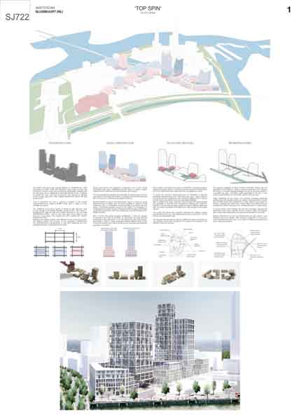
The general configuration of the towers is composed of a flexible system of dwellings - rooms in case of hotel - orientated to South with the possibility of longitudinal growth as are the neighborhoods of the Grachtengordel and communication gallery to the North. This system is embraced in its East and West facades by a skin of vertical communal orchards. The plinth concentrates works, services, commercial or cultural spaces. These spaces repeat the urban performance of the Grachtengordel neighborhood with a unitary frontage and flexible dynamics of organization inside, allowing adaptation to the programs. The commercial ground floor - restaurants and shops - articulates the exterior of the cluster and the interior gardens. Occasionally, this first level of the plinth acquires verticality with shopping and leisure areas.

Jury comments


Jury:

This scheme is based on the concept of archetypal plots and buildings of the Amsterdam's city center. The (romantic) idea of using existing typologies is interesting but difficult to realize. The jury is not convinced by the theme of urban farming on the facades. The proposal is very architectural. The guidelines are not very strong or workable for the municipality.

Bjarne MASTENBROEK

Ellen HELLSTEN

Jürg DEGEN

Mark RABBIE

Marlies ROHMER

Mattijs VAN RUIJVEN

Olivier MEHEUX

Ruurd GIETEMA

Tania CONCKO

Project Team

Agustín Gor Gómez, (ES), Architect
Carlos Gor Gómez (ES), Architect

Antonio Jesús Guiérrez García (ES), Architect
María Fernanda Barquero Barahona (CR), Architect
Anastasia Chaidi (GR), Student in Architecture
Martyna Smolareak (PL), Student in Architecture
Marco Pallaoro (IT), Student in Architecture
Luca Pasquini (IT), Artist

Contact information

info@grxarquitectos.com

Gran Via de Colón 14-B, Ático 18010, Granada, ES